
The only way to get past that is just set aside a little time to work through using the board. It’s a new game to be learned, and setting aside frustration and approaching it like a puzzle you’re choosing to put together, makes things much easier and faster 
7 Likes
The posts that are pinned at the top of each forum/category have always been pinned there. You now have the option to unpin them yourself. Mentioned above, you can either click the pushpin icon next to the thread title to unpin, or you can click “unpin this thread” at the end of the thread.
There’s also a setting in your preferences that you can customize to decide whether or not you want pinned threads to unpin automatically when you’ve scrolled through to the end of them (read the thread).
You can do this. We currently have the home page set to take everyone to a general forum/category list that resembles the old site. However, there’s a Latest view tab that will list threads with recent posts. There’s also a New tab that lists new topics that have been created in the last few days. Using the Categories drop-down menu on the left you can sort either of those options by a specific forum. Here are screen shot showing Latest and New in Around the Farm, for example:
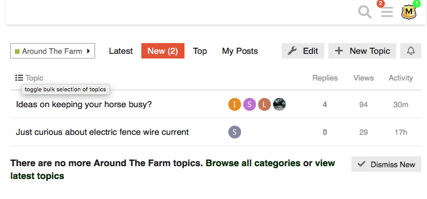

There’s even a red line to show you what content is new since your last visit to the site. Does that help?
4 Likes
Yeah, these are things I miss.
But hang in there, @bingbingbing!
If this septuagenarian (  There, I said it out loud) can figure it out, you can too!
For me, daily visits - oftime more than once  - have gotten me more comfortable navigating.
4 Likes
What I’ve also found is that the improved performance encourages me to visit rather than where it was getting to the point that I dreaded visiting because of how time consuming it was.
I’m all 
 over both the functionality (and finding many different ways to navigate as opposed to the more ‘structured’ single way to navigate that vB offered) and significant performance improvements.
Yeah, glitches and things that aren’t working yet but I’m willing to wait for the short preview on the title hover while the dev team works on things of more significant impact (like fixing user’s usernames and such).
3 Likes
I realize that’s the intent, but in practice the thread titles are all cut off and not really readable or usable.
My suggestion would be to consider:
- Make the left side of the table with the forum heading shorter, even if it has to wrap
- Make the right side longer and also include the whole title for each thread, even if it has to wrap
- Include the author name with the thread if this can be made to work
- Another way to do it would be to make this display more of a block for each category, with the category title in a headline format, the inner content indented a bit, and not have the left-right split, but that might be a harder ask.
The 4/week, 2 new portion of the display is IMHO not useful and if anything makes the forum look less interesting and less active than it really is.
The threads listed also tend to be sticky threads, which (a) don’t change and (b) have old start dates on them. Thus, the home page looks like we have categories that haven’t had new posts for 2-3 years, which is very much not the case.
I think some adjustments here are very doable, will make the place look much more active and much more like home.
2 Likes
Click the pin to unpin those.
1 Like
Once we got past the initial slowness, I have been enjoying the new format. So it’s not accurate to say no one likes the new forum. I think we just tend to hear from the people who are unhappy or lost.
Rebecca
8 Likes
I think what may be more accurate is that almost no one liked it when they each first tried it… we knew how to navigate vB, albeit slowly.
What I am personally like to read about is users who didn’t like it when they first started but are now both liking the zippy performance as well as the options and features that allow people to navigate as it suits them… I may choose to read topics via, say, Unread while someone else wants to peruse forum category by forum category.
I’m also much appreciative of both @Moderator_1 and the developers who are listening to what we don’t like and help us learn maybe a new way of doing it or passing it along to the dev team for them to address. 
I also just discovered a new thing… (behavior?). When I type the @ to tag a poster, I used to have to type, I think, 3 characters to get vB to begin to pull up a list of possible matches. This type, I typed the ‘@’ and the drop down list I got was of users that I have more recently flagged 
5 Likes
I agree with this.
I actually like this new format. I had my doubts when I first tried it because it was so sloooow and glitchy but it’s vastly improved now.
Using it, playing around with it, is the best way to get familiar with it. I discover new features every day
I recently discovered how to go to the last post in a thread (click on the time). That was a DUH moment for me 
3 Likes
You aren’t the only one with a ‘duh’ moment. I was still struggling to understand why, when I clicked the neon green ‘dot’ by my avatar (personal of interest as I understand it), it would take me to the middle of a thread… left me ??? But if I clicked on the little neon dot next to the topic (say in Unread list) (general interest) it might take me to the end of the topic.
Well,  the personal interest dot also includes when I had posted a reply and someone 'Like’d it. The general interest neon dot is replies but not necessarily Likes.
So, here’s what my Categories screen looks like right now. Yes, the longer titles are cut off. But they got cut off on the old forum too, there was just a bit more room. And that doesn’t count the thread titles from people that were vague and you still didn’t really know what they were talking about
To me, I can tell quite enough about most titles to decide whether it’s worth my time
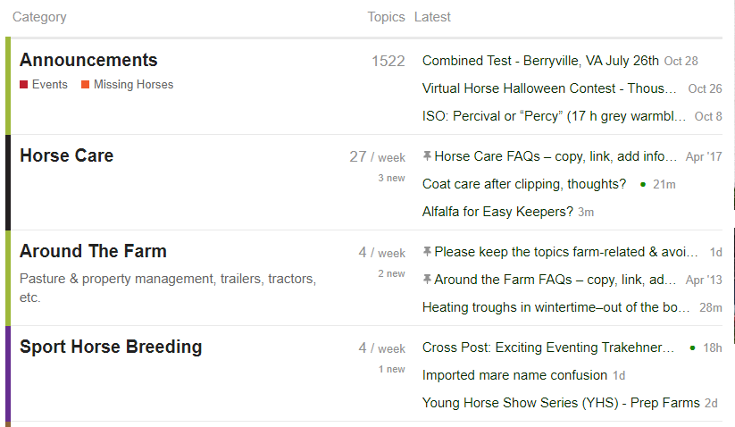
That said, I do agree that if the left column (Category)can be shortened a bit, and the right column (Latest) increased, it might be easier to “see”. The description of the Category (see Around the Farm) already wraps, so no biggie
2 Likes
I’m a fan of the new layout, though, as of now, there are several hiccups that are really messing with my experience. As of right now I find it difficult to just browse the forums because there is no search feature, links from Google don’t work, and the pages just go on an on and on. This means I’m only really looking at the newest forum posts and if there aren’t any, then I just kinda leave.
Search came back several days ago. Search is HUGELY improved over the last forum.
Click the magnifying glass icon that’s to the left of your avatar and the three line hamburger menu in the upper right.
2 Likes
Google searches aren’t how to use the forum The broken search links are, IIRC, something lower priority to be worked on. The built-in search function is way better than it used to be, though probably still not as robust as a real internet search engine
Look at the Infinite Scroll topic in the #technical-help-forum category/forum. Grab it and scroll. Click it and go to any post # or date you want. Click the 1m or 11m or 7d “timestamp” to go to the bottom of the thread.
1 Like
I find the new version way “too much.” But, I am old school. I prefer simpler visuals, and I don’t care about having 5,493,986 levels of functionality when that added functionality is work to learn, and complicates the visual presentation of a page. If I have time, at some point I will go through the FAQs to see if I can simplify how things look, but, if something requires me reading instructions in how to simplify it, it’s already an uphill battle. Sometimes less is more.
But, on some rainy or snowy day in the future, maybe I’ll try. For now, all the pleasure of reading COTH is ground away by how complicated the visual is. Maybe now I’ll be able to stay more caught up on all the other things I should have been doing instead of reading the COTH forums.
9 Likes
Simke, the thread slider does not slide, if I can get it to move at all, it jumps. I can’t get my cursor to stay on it, or attach to it with any regularity. It’s hard to explain. IDK, I’ll sort through this one way or the other although I may rip out a few hairs along the way, lol. I’m going to try and edit, let’s see what happens.
ETA: Well, I can do that
2 Likes
I very much miss not being able to hover over a topic and get an idea about it. Not wasting my time to explore every topic just in case it might be something I wish to learn more about.
3 Likes
We’ve heard this from a few people, so I’m curious–what browser are you using? Desktop or mobile?
You can grab the “flag”…the post number/post count/date box to the right of the actual thread slider bar, and move that instead. Is that any easier for you?
Yeah, this is a known issue and coming back.
Known issues are listed at the top of the main feedback thread in #technical-help-forum or at the bottom of the FAQ thread in that same forum.
4 Likes
It is a big change, and I for one REALLY like it! They more I use it it the better it gets. The mobile version for Android is night and day better, so know that your experience will vary based on whether you are on a phone or computer. Functionality is the same, it just looks a little different depending on where you’re browsing from. There are a couple of features that are currently missing but the developers are aware of them and they will eventually be back. In the meantime, poke around, click on things, pull down menus, read the FAQs - just play with it and learn how awesome it is!
6 Likes