breeches with logo on left thigh?

[QUOTE=ybiaw;8901747]
I don’t like it just because I don’t think riders (especially hunter riders) need to start looking like NASCAR drivers with logos all over them. It’s already bad enough with some of the jumper riders (like Ben Maher, for example - love him as a rider, but between the Land Rover and Equiline and all the other logos he has monogrammed on his jackets and shirts, it’s like come on dude, enough).[/QUOTE]

Hell, if it will reduce my equipment costs, they can emblazon logos over both my T and A! I’ll even have my coat shortened for a better view!

(Since I have a sizeable tail, I might be able to fit TWO logos. Increased fee for sole sponsorship rights? :smiley: )

5 Likes

I have sat with judges that find that tag annoying…FYI

Sponsors PAY Jockeys to wear there advertising logos on there leg , so anyone who is wearing these and paying for the privilege to advertise a companies product for free on there leg is a fool. You should be getting paid for it , and perhaps some BNR’s are getting these for free in order to sell to them to the regular people …

1 Like

Do these Equiline “Ash” breeches really offer superior grip? That is all I want to know. I did try them on once and they were not very flattering for my middle-aged wine/food-loving body, but I might consider them if they help you stick in the saddle. In my view, there are many other more lovely breeches at this price point, namely Samshield breeches, which are actually flattering for a person who is not 5.10 and 110 pounds.

They offer as much grip as your standard silicon knee patch breech - I have Romfhs, Ego7 and Cavalleria Toscana breeches that all feel as grippy, if not more. I am not a big fan of the Equiline, frankly I just don’t like that fabric and prefer a fully synthetic breech like the Samshield or CT.

Equiline does also offer the Bice breech, which is the Ash (the “triangle” breech) sans triangle, which was introduced specifically for the USA hunter/eq market because the US distributor correctly guessed a lot of folks would hate the triangle. And now, ironically, everyone wants the triangle… I guess there’s no point in wearing the $400 breech if people don’t KNOW it’s the $400 breech!

I feel like I first started noticing this trend among some European FEI jumper and dressage riders maybe as far back as the 2016 Olympics. I found it super distracting then, and still don’t like it. feel like it distracts from the overall image and makes it look like you totally dinged your breeches right before you went in the ring.

But, whatever. Every time a new trend comes around, it is distracting until it just becomes the norm. Super short jackets, longer jackets, rust breeches, side zip breeches, pancake flat saddles, brown tack in dressage. The examples are endless.

I find horse people to be some of the most resistant to change in general. Otherwise we’d long ago have stopped wearing outfits in the show ring that makes us look like a footman on a 1800s carriage when we want the rest of the world to treat us like athletes.

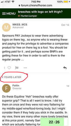
Just curious. Was there any more obvious notification when this zombie thread first got bumped up? I thought there was supposed to be some sort of sign on this new board, but this would be very easy to miss. I scrolled right by it.

1 Like

HA. I’m glad you said this. I bought a pair of the Ash and wore them at a show for the first time. My first thought (& said it out loud to my trainer) was how slippery they are!! I ended up falling off on the last day and breaking my arm…

It is far more than the old forum did when a zombie thread was bumped.

I do not know if the person posting in a zombie thread gets any type of notification.
@Moderator_1, do you know if the person posting gets some type of notification?

It is certainly more than it used to be.

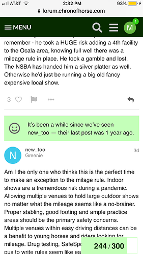
But the notifications on threads when there is a reply from a new poster or a long dormant poster are much more visible and noticeable.

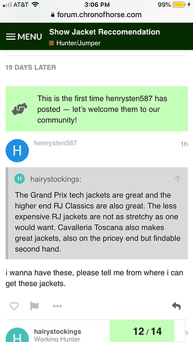
Hmm. For some reason now I am unable to attach a screen shot. But the more obvious notification has a green bar across the screen with some text in it to point out the new poster. Much more helpful.

There we go. Phew!

Here’s another example for a different poster with a different situation.

I’ll see if we can make those “time lapse” since last post notations stand out more…without them becoming too obtrusive.

Thanks!

Thanks.

Although sometimes it is entertaining to see unwitting people have a lively debate about what someone should have done ten years ago. Lol.

4 Likes

Thanks everyone for the tips on these breeches, still a cause for commentary!

1 Like