
ooooh, gotcha - yeah, not sure what the deal is. Back works just like it always did
1 Like
Hmm…my history doesn’t show multiple positions in the thread, and the back button works for me. Please report in if your back button behavior is different.
I did find that this multiple entries in the History behavior is a known “thing” and it relates to how the site saves your place in a thread as you read and changes the URL to reflect your position in the topic – so you can share a link to a specific post, for example.
It also serves to let you follow a link to somewhere else, and then if you want to come back to the thread you were reading, it should take you back to where you left off.
I guess something for folks to be aware of it that if you want to share a link to a thread, and you want it to direct someone to the top of the thread, you have to copy the URL from the first post (or manually delete the post number from the end of the URL).
1 Like
I am not sure I will ever find coming here enjoyable or relaxing as it used to be. That said, I will still come back and use the search function if I am looking for info. But to browse and enjoy looking for recent posts that are interesting. Probably not.
The white background on the whole page is just terrible. I am sure there is a way to change that, but I don’t see it under my preferences, so I can’t imagine where else to look.
4 Likes
I have been using my back button regularly and it works fine. Takes me … well back to whatever I was at before I came to this thread.
1 Like
I have the same issue with the scrolling bar on the far right, it jumps around, you scroll to the top and it jumps back down to somewhere in the middle of the posts etc. I use Microsoft Edge.
A lot of suggestions have been posted but you might want to post a picture of the icon you are saying to use to do something. Someone suggested hovering over the flag for doing something but I just see a flag for reporting a thread, so I’m not sure what flag they were referring too. Same with the hamburger??? Is that the round pic of your self or what. I got a private message to reply to for instructions but never got them, was that legit or did I just get scammed?
Overall, not crazy with the format, don’t like the continuous page set up, white background is a bit hard on the eyes. I have yet to find the quote feature.
I don’t mind change but at some level it needs to make sense to none tech users.
1 Like
If you go to the technical help section there is a thread with FAQs. You will find lots of answers there. Here is a link for you.
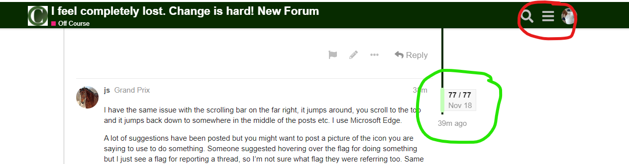
Quoting has options. You will see them in that thread I linked above. The easiest is to highlight the text you want to quote, a grey box that says quote will appear, click that and it will put the highlighted text into your reply box. Here is a screen shot of me quoting your post.
I believe the reference to a flag was to the date and post number flag. I have circled it in green on the screen shot below.
The hamburger refers to the item I have circled in red on the same screen shot below.
5 Likes
That was cheeky. Everyone has different learning styles. Please respect that… 
2 Likes
The more I use the new platform, the more I like it (and I’m a user who’s here just 10 or 15 minutes a day on my phone so it’s been a slow process!). Each new capability I stumble across is a good one that improves my experience.
The improved search alone is worth the pain.
I still have quibbles with the look and feel - all the whitespace and the rainbow colors challenge my eyeballs, and my overwhelming visual impression when I visit is “wall of ads” - but I’m adjusting and I’m hopeful that some of the suggestions made by others regarding column width, etc. will be implemented.
2 Likes
I don’t want to make any guarantees, but I’m pretty sure we’ll be able to offer a alternate “theme” that tones down avatar circles. I will also check to see if a dark background theme can be enabled.
Some of these preference-related tweaks may take a while to customize and implement, and we have to triage feedback…so, right now, fixing log-in issues is number one on the list. I’m working on consolidating feedback and transferring it to the chief button-pushers!
6 Likes
No, I don’t love the new format. On my phone, which is mostly what I use to read the forums, it is incredibly difficult to figure out how everything is organized. I was ready to give up on it when I decided to try it on my laptop and iPad. It is much easier to navigate on them. On the phone, I feel like I’m playing a game of Marco Polo–my eyes are closed and everyone is yelling “Polo!” all around me. Unfortunately, my phone is typically the device I have near me on my downtime.
As others have mentioned, not having page numbers is a huge turnoff for me. That’s how I organize my memory of pretty much anything I read, in pages. The slider, again, as others have said, is not easy to operate–practically impossible on my phone.
Despite these complaints, I appreciate that the COTH provides free forums. I appreciate the wealth of knowledge and resources available here. I appreciate that they are trying to make the experience better for a bunch of folks who probably don’t even subscribe to the magazine. So, for all that, I’m grateful and think my complaints matter little.
2 Likes
@seabreeze Have you tried using the Desktop View on your phone? Perhaps you might like that better. You can try it out by clicking the three-line “hamburger menu” – at the bottom of the menu should be option to switch back and forth between Desktop and Mobile views.
If you can give some specific examples of what is confusing or unappealing, maybe we can give some suggestions or explain some functions that might make your experience on mobile more enjoyable too.
2 Likes
The desktop view is much better. Thank you.
2 Likes
This is one reason I am glad they have allowed for the different modes. 
For myself, I actually like the mobile/tablet mode better than how it is on a computer/desktop mode.
While it did take me a minute of clicking around, I find everything easily accessible, pretty self explanatory & the forum flows much better… IMO
I’m finding myself coming here more often than I had on the old forum.
4 Likes
I do find I am avoiding the forum. The presentation does not read well at all for me and simply does not seem worth the effort. Oh well.
4 Likes
Have you tried checking the forum out while in a different mode?
Mobile & desktop are a bit different.
Might make a difference for you.
3 Likes
I’m not Discourse’s biggest fan, as evidenced by my replies in the other thread.
But I would encourage you to just keep plugging at it. I enjoy your posts on this forum and it would be a shame to lose you and other members who are having trouble navigating the new forum.
There are many things I don’t love about the new forum format, but I find there are some small changes that are better. Search function is tremendously improved. I like the notification set up system. Certain reply features are better, such as being able to copy/paste images instead of just upload them. And I’m glad we have “related topics” back - that was something I missed in the last forum roll out.
I found the more time I spent just poking at things, the more I figured out. But it was not easy or even intuitive to do so. So you are not alone in feeling the forum is difficult. The moderator has been very good at trying to find a balance between feedback and what Discourse can provide.
4 Likes
But it also sounds like it is getting less difficult as you have spent more time here?
1 Like
Yes, and no.
With any change, comes an adaptation period were you are rewiring your previous ways of thinking and operating, for the new ones. This does not make it less difficult. It just means the person has learned how to navigate around the difficulties. I believe for many of us we will just have to learn how to navigate some of the unnecessarily complicated parts of Discourse, if we want to continue using this forum.
It’s just what it is. I’ve mostly raised my concerns about accessibility on the other thread, they’ve been heard, and I appreciate that. I won’t beat a dead horse here, too. 
1 Like
I’ve been dutifully trying out the new version and although I don’t like aspects of it, I’m learning and adjusting.
It seems to me that usage has dropped a great deal, though. Perhaps I’m wrong, but it seems like there are few new threads and not tons of activity (in general) on them.
3 Likes
I think that usage dropped back a ton before the switch. Most likely because of how slow the forum was. Hopefully now that we have a zippy forum people will come back.
2 Likes