And I, for one, am glad you guys did bite the bullet and do the conversion. Not always fun for any of us at times, not always easy for any of us at times (including COTH devs and mods  ) but IMO, totally the correct decision.
There are lots of people living in crumbling houses and insisting that “everything is fine”. People see what they want to see.
It’s called “house blind”. If you don’t see a problem with the leaking roof and the uneven floors, and have no worries about whatever is about to happen next, then the house is fine.

Honestly, I wish this wasn’t my most popular post. Though, without page numbers, I’ll never know for sure. 
I will say that what I absolute dislike the most is the white background for the whole page and second worst is the crappy little font. Hate it. Hate the white background; no border between the forum posts and the side “stuff”.
The font looks the same to me, not sure what you mean by “crappy,” but you can change the font size itself in your settings.
Click your avatar in the upper right, then your user name, then preferences. Then interface. Select larger or largest from the text size drop down and hit save.
The font does not look the same for me, I will look into your suggestions.
Can you address the background for the whole page being white? Is this being addressed?
I’m not sure if @Moderator_1 has mentioned anything about background color, and there’s not been much negative feedback about that, but another theme with less avatar flash is being investigated to see if that’s possible, so maybe a “softer” color theme could also be offered?
The devs have certainly been working hard on some big deal functionality patches, so just hold tight for any potential visual updates 
I am not losing any sleep over this.  But it feels a long time, long distance, rock solid friend got married to a jerk.
I do hope things improve visually. There are no boundaries between posts and side stuff/ads. It is visually quite unappealing.
I did enlarge my font size. I still feel the same…not great.  And maybe once they hopefully change the background, it will be easier on the eyes.
Best would be if everyone could adjust the background.
Some can see it better as is, others may want it different for them to see better, not everyone sees the same.
I do have lines between ads and posts?
A thinner black vertical line on the left, the scrolling light green one with the dark green scrolling bullet on the right.
I have this too.
Page numbers varied since you could set your pages to have 10 or 30 posts, IIRC, but post numbers - visible always, were the same 
There is a border on the left, a thin gray/black line. It is also the right-most border of the ads on the left but it remains as you scroll past ads. On the right is the green scroll bar as the border. Beyond that I’m not sure what a border between the forum stuff, and the columns of ads, would do?
And YAY! I see a shadow around my screen shot now!
Well pewp! The shadow was there when my post saved, but after I added my next reply (this one, which I’m editing) it disappeared 
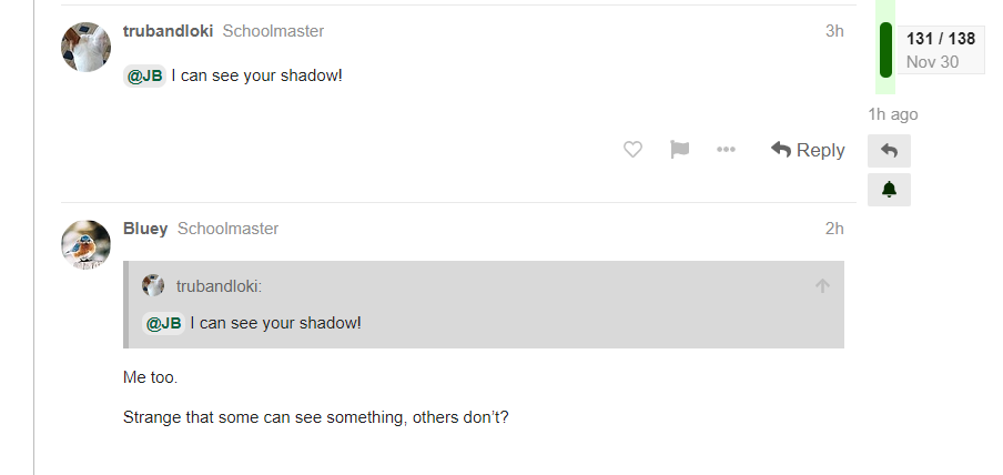
Me too.
Strange that some can see something, others don’t?
I still don’t always see the shadow on mobile, even when it shows in preview. Weird, huh? 
(On mobile now, no shadow. Sad for me!)
I reported earlier the missing shadow on mobile, so we can check in later on that if it’s persisting after they start working more on tweaks vs. the log-in error fix. We’ll also be able to look more into the possibility of incorporating alternate theme styles.
@bingbingbing Are you not seeing the lines between and next to posts as shown in JB’s screenshot in post 129?
It would separate things more. And maybe it’s not a clearer border that I am looking for, just a clearer separation. The background of the whole page is white for me. It is not easy on the eyes and it all blends together.
I kept my posts per page the same, so I always had an idea of how long a topic was. I will adapt to just having the number of posts.
I am not having trouble navigating. The turn off for me is all visual. 
Yes, I can see the thin line separating the side white from the white and between posts. The line between posts is thinner or maybe it looks thinner because it looks grey and the side one is black.
Desktop or mobile platform?
On the desktop platform there are lines between posts, to the left, a line and to the right the timeline slider.
Trying to re-create what happened last time. I’m replying with a screen shot to see how the shadow thing works, to maybe get more insight:
Ok, I see the shadow in the preview screen, and will hit Reply now.
Soooooo - as long as my last reply was on screen, I saw the shadow. I scrolled up, so it went out of view, and when I scrolled back down, it wasn’t there any more. So a “refresh” makes it go away?


