Interesting. You’d think the opposite would happen. Hopefully they can get the shadows working for all. It makes a world of difference just to have a little separation between pics and posts.
Not for me, there’s not. I see the thin border on the right side of the ads, but it doesn’t remain as I scroll past the ads.
There is a faint greyish line between posts, the width of posts. I also see the screenshot shadow line.
I’m using Firefox on a MacBook Pro.
I understand that the log-in issue takes precedence over visual tweaks, as it should, but I do hope for the future ability to adjust the look in some way.
There is a difference between “features” and “benefits.” Perhaps everyone doesn’t feel as though they benefit from some of the new features.
For me, I originally came to CoTH for the benefit of the broad and deep knowledge base, and I became a member (rather than an occasional lurker) for the benefit of the collegiality. I’m most interested in the features that benefit me in those two ways.
I imagine that CoTH itself is most interested in the features that confer the benefits of increased ad revenue, increased security, and less emergency maintenance, but also a greater number of visits and participation (which attract advertisers).
It would be unfortunate if some long-time members - who may even be relatively infrequent posters. but who have something valuable to offer when they do comment - disappear because they feel overwhelmed by the changes.
can you take a screen shot and post it?
I only see borders around ads on the right, I don’t see any delineation on the right once the ads are gone either.
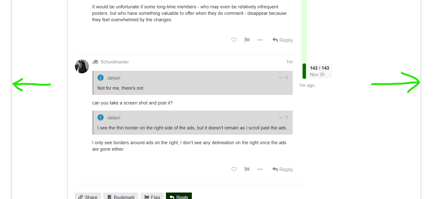
I have a shadow line on either side of where the ads are above.
Screen shot for you of what I see on my screen. I have drawn green arrows so there is no confusion of what is visible on my screen shot versus the shadow line around the screen shot.
OK, so the screen shot is too wide to see the one on the right.
And just for reference, I again used the reply arrow in your post JB and that is not showing.
Editing to add - the screen shot is wide, so click on it to see it all.
Ok, so the 2 red arrows point to the outer-most vertical lines that are the edges of the whole forum - no ads or anything outside those
On the left, between the red and green arrows, is the column in which the left ads sit, and the inner green arrow line remains through the whole scroll.
The right ads don’t have a defined column, they just have a right-most edge, which stays through the whole scroll. There’s no inner column line, so there’s nothing that stays past the ads
And @trubandloki you are, I assume, hitting that Reply circled in green? Assuming so then no, I am not seeing that you are replying directly to me either. So weird.
Yes, that is the reply I am hitting (here and in the other thread where I mentioned it was not working).
I figured it was, you’re a smart cookie, just making double extra sure 
Oh no, I am computer challenged and willing to admit it.
It was a good question.
I see that feature is working for others today (I just saw it showing for someone else).
(PC using Chrome if that matters to the discussion.)
Hit that reply on yours and it shows in my preview that I’m replying to you. Let’s see if it does when I post.
Yep… seems to be working for me with the direct reply. I’m on desktop.
@Jenerationx do you see that trubandloki replied to me? Just curious if we see things differently if we’re the one replied to.
Nope. I don’t see those as direct replies.
Oh… and this one which I hit reply on your post doesn’t show either.
Just discovered there is a line beween posts! Mine is so pale I never even saw it until it was mentioned upthread and then I had to squint to see it. Is there any way I can darken it? It would make reading much easier. Thanks.
Ok, I’m direct-replying to @Jenerationx here. Let’s see what happens. It doesn’t show as a direct reply in the preview pane.
so the direct reply is working sometimes for you but not others. So weird.
I believe the direct reply indicator in the upper right corner does not show up if your reply follows right after the post you’re replying to.
Testing now.
And testing with a post not directly preceding this one.
ETA, yup, I think that’s what’s going on there.
Ahhh, interesting. And, totally makes sense!
Still, per our other discussion on this, I vote we either quote what’s being replied to, or at least move the reply visual over next to the username of the person doing the replying. All the way over there in the other corner is easier to miss.
Thank you Mod 1 for explaining that. It makes sense now that you have explained it.
I am fine with no quote when using the reply button. It gives you the option to read what is being replied to. I like it that there are two options (quoting and replying without quoting).
I haven’t been on the computer version, just mobile & desktop (while on a tablet or mobile).
In both versions, while on a mobile or tablet, it is quite easy to differentiate between the actual post & the screenshot being shared.
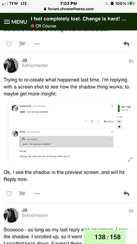
I took a screenshot of your post, in which you shared a screenshot. You can see the obvious difference, even if the “shadowing” doesn’t show up.
Hope that helps… if it has nothing to do with what you were talking about, please disregard 


I actually have no problem distinguishing most screen shots because there’s more to the image than just text, and even the text looks different. I think the original issue was people were screen-shotting just text, and it is harder to visually separate actual text, from screen-shot text. I don’t know why anyone would screen shot text - just quote it. But I THINK that was the root of the issue.


