This thread makes me laugh because I’ve been reamed out on here for voicing my opinions about colours and fashion. 
I agree with most of superpony’s ideas, except that I do NOT like the light brown jacket with the rust, I would go with the dark navy, for the exact reason you DON’T like it, it stands out more. The light jacket makes it all a bit bland. If you rocked a DARK navy with those rusts, it would be wicked. I’ve seen your pics before and I have a similarly coloured pony and I have always thought that, but never had a reason to say it.
Black/Dark bay - Possibly the most versatile colour, almost anything can work. French blue, teal blue, and grey-blue being the best. Medium-dark browns being the worst because they won’t have enough contrast. Black is always classy, but can also blend if the bay is very dark. Dark bay can be stunning, but also blend (or even bland), a bold contrasting jacket will help you stand out especially in hacks.
Medium-light bay - Classic navy and black are lovely. Green, especially darker olives and darker emerald (more rare) look amazing, but are less common. Dark brown, dark grey, can work, but I don’t love it. I rarely like light browns, taupes, and light greys… the warm tones of the shade of bay look best with warm tones in brown/grey, anything too cool clashes, especially with bright shirts!
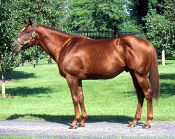
Dark chestnut - Another versatile colour… almost identical to dark bay, but excluding black except for equitation. Black on chestnut can be very STARK, but is nice for classics and eq. Chestnut also looks amazing in most shades of green. Warm black cherry/purple looks very nice, but is rare.
Medium-Light chestnut - Here’s my opinion people don’t like… I despise light greys, browns, and taupes on these lighter and brighter chestnuts. Especially the cooler tones. Some blend in and some really look like (I’m really sorry, but I can’t help how I feel…) someone vomited all over the horse… I prefer navy and basically all shades of blue, including French blue (blue and orange are complimentary colours), most shades of green, and dark rich browns. Warm black cherry/purple looks very nice, but is rare. I prefer black only for eq and classics.
Grey - Grey looks amazing in blues and complimentary shades of grey. It’s hard to describe how to know if the grey is right, but like superpony said, you don’t want to be all one colour. So lighter or darker than your horse’s shade, preferably with a brighter shirt. Teals are rare but look AMAZING on grey. I have a purple jacket (cool shade) that would look FANTASTIC on a grey! Greens work, but best if they are cool. Cool colours over warm. No browns or taupes… eek. Black is classic and matching, but a little boring maybe?
Dun/Buckskin - Wicked in black. Might not be so original, but looks stunning. Navy and darker blues also work well. These are loud colours that garner a lot of attention on their own. Don’t try to make yourself stand out. Just compliment.
Pintos - Follow ideals for the non-white colour on the pinto and remember “less is more”. Again, your critter is already loud, let their colour stand out and shine, not yours.
As for shirts, I think it’s a bit of a personal thing. Some people have a skin tone that would carry a light brown jacket and peach shirt, but I would look like death. If your jacket is a very similar shade to your horse - grey jacket on grey horse, light brown jacket on chestnut, black or dark navy jacket on dark bay horse - choose a brighter or (if you dare) bolder shirt colour to add contrast and brighten your tone. White works with everything. It’s still ok to wear patterned shirts.
And here’s my biggest pet peeve…
If you are going to go out and get one of those tan-brown GPAs or brown/brown GR8s, please, PLEASE make sure the shades of brown you’re wearing it with are in the same family!! Especially if you’re riding a chestnut. When you have 87 different shades of brown going on, it can be really overwhelming. The brown GPA can be particularly difficult to colour-match. This is only my opinion, but I feel strongly about it.

 I guess I should use it as an excuse to by a French Blue coat.