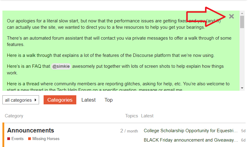
Are you talking about this green box? Click the X in the upper right hand corner to dismiss it.
I don’t find use in the round avatars as so many are one letter that leaves you wondering, unless you go searching for more information.
A name gives you all information just by coming across it.
I do agree that, no matter what color/s, if round avatars or not, more or less bright colors, things as they are being sure fine for just reading for content.
I would love to have names with location and original posters somehow highlighted thru the threads as they respond.
I do miss just getting to a forum main page and the little green dot that told me which threads I had responded to.
I used that to keep track of posting numbers, no more than 1/3 threads per 30 thread page.
If I had reached that, I would just not participate in any more until that number went down.
Harder to keep tab of posting now, having to guess at that, the notifications and other all over, not in one nice system at a glance as before.
My impression is, other than some requests already on the list to be added, now we are more into the users needing to handle this on their end, not necessarily the web site to change to suit this and that and a few more, at times antagonistic wishes for changes.
Then, as the Moderator presented it, the powers that be are willing to accommodate as many as possible, so bring on your suggestions and lets thank them for working and trying so hard. 
Just looking Off Course this mid Sunday morning …the date stamps on the threads are 13 hours old… I do not remember such gaps before. Some forums are going multiple Days without posts or new topics.
The problem I see now is becoming how do you save the board.
I have been noticing that also, threads have new posts, but the minutes/days notifications are not correct.
Mod 1, it is great that you are trying to make the forum a happy place for all. You truly go above and beyond!
Will a grey reading background make it harder to tell the quotes (which are in grey)?
I like knowing, before I enter the thread who the original poster is and who the newest post is by so I do use the avatar string at times. If they are going to go back to having that information listed in names then I suppose totally getting rid of the avatar circles there will not matter.
If you hover over the avatar it will give you the name of the poster so no real searching is required.
I know, but I don’t see that good and hovering over anything is tricky, may get other nearby showing up.
I just manage by guessing or just reading more than I would, trying to find what I really want to read.
Just takes more than glancing at one name was my point.
@eightpondfarm I just added directions about how to close the notification banner to the notification banner.  That would definitely impact the usability of the site if you thought you had to navigate around that big green box every time!
Thanks for letting us know – if you were having trouble with it, I’m sure you’re not the only one who was.
Just checked that again and now they seem up to date?
May just have been off here and there while they were working on other in the background?
I too will say, this site is way better all around, if we want to be honest, even with new things to learn to use or get around, than the old one had been for very long time.
Thank you for taking the jump and getting this up and running, no easy task at all.
The problem I see now is becoming how do you save the board.
I keep wondering why you keep coming back when you don’t seem to be happy with the changes made and also continue to imply this board will be going away?
I do not remember such gaps before. Some forums are going multiple Days without posts or new topics.
This made me laugh.
I must admit, that even during slow times (and there are frequently times that the forum seems to have less traffic) I have never paid attention to the actual times of the posting.
I like the new format now that I’ve adjusted! The font and background colors are fine for me. I find it streamlined, not too stark. I recently figured out how to increase the font size in my settings and that was a huge improvement to my reading experience! I read on my phone 90% of the time and the default font was tiny.
As far as a wish list… I also don’t find the avatars useful or identifiable. I usually browse on my phone by “Latest” but the times I’ve gone to the “Categories” page on my desktop I thought it was cluttered and awful-looking. I too liked to be able to see the name of the OP and the latest poster, but all the avatars are too much and not useful to me.
I also wish the OP would be labeled as such throughout the thread, though I don’t know if that’s the kind of formatting feedback you’re looking for.
Best new setup is ability to check latest across categories without checking each individually.
Mostly I’m not signed on when browsing so perhaps that makes a difference but on the phone the circle/avatar seems to reflect latest poster (not the opening poster—this would be preferable) whereas on desktop lefthandmost circle seems to be original poster; encircled in green if they are also latest to add to thread? It’s usually easy enough to grab latest time stamp & scroll up to where i might have already browsed but would really like some sort of time stamp (used to be there?) indicating when the thread was started—-perhaps even within a hovering note.
Agree colour scheme seems stark —the fluorescent bits are more annoying than dark, flat colours for contrast to my eyes.
I also wish the OP would be labeled as such throughout the thread, though I don’t know if that’s the kind of formatting feedback you’re looking for.
This is on the wish list. If you go to the FAQ thread or the long thread about the new forum (here in the technical help forum) the original post in both places has a list of the things that they plan to try to do when the big bumps are figured out.
We’ve received some feedback that the new site is too cold/stark feeling.
The previous version of the site had a similar black on white color scheme, but I appreciate that other components of the layout can make even the same color scheme read or feel different.
I don’t remember what colors were on the old site but the layout here seems about the same at the top of threads. It’s when you get to later posts, which is the default if you’ve read it before, where it looks stark and empty. There is just white space where anything related to the magazine is, and then more white space on the outer sides of that. Maybe changing the background color behind the columns to the left and right of forum posts would help.
The Wayback Machine is a great way to review or remind what it used to look like:
https://web.archive.org/web/20180321071012/https://www.chronofhorse.com/forum/
Who remembers this??
https://web.archive.org/web/20120307162951/http://www.chronofhorse.com/forum/
Or this? 
https://web.archive.org/web/20050315022801/http://chronicleforums.com/6/ubb.x
Looks like the columns right and left of posts were a faint grey?
Maybe that is what some want, not just bright white?
Thank you Mod for showing me where the X was. I feel kinda dumb not seeing it. So, about the continuous scroll… There are many times when i wish to read the original post again. And many times when i just want to jump to the end. Very long discussions mean a lot of scrolling to accomplish either of these things…and if i want to read the OP, then go to the end …well, that’s double. Could there be a fast forward jump to top or ff jump to end button?
Could there be a fast forward jump to top or ff jump to end button?
Yep! We have several ways to do both of those things.
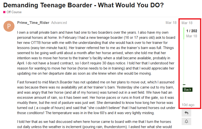
The thread slider tool will zoom you to the top of bottom.
How do I navigate within a thread?
There are two tools to make thread navigation easy:
The thread slider tool is found to the right of the thread text:
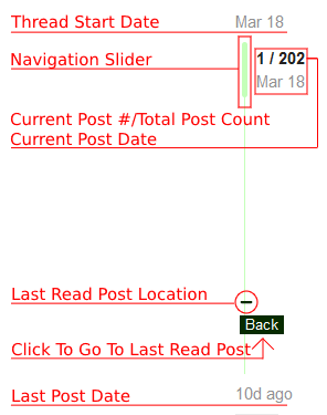
Breaking down the elements of the thread slider tool:
To quickly navigate within the thread, drag the navigation slider up or down. You will see the current post number and current post date change to reflect where you are in the thread.
Below the thread slider tool, there is a reply button, and a button to change your notification preferences for this thread.
The second tool for thread navigation is the first post footer. It is found at the bottom of the first post:
To go directly to the last post, click “Last Reply”:
To see who has posted on this thread, click the down arrow to the right to expand:
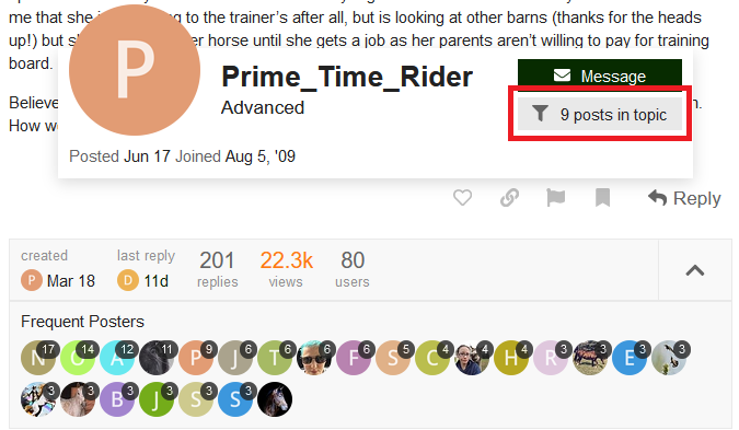
To filter the thread and view ONLY posts by a specific user, click on their avatar and the “filter” button:
Or, you can click the thread title to go to the top of the thread.
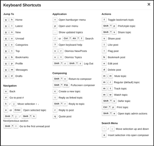
Or, you can use the keyboard shortcuts. Typing # when not in a reply window will pop up a box that allows you to enter a specific post number. Enter 1 to go to the top, or the last post number to go to the bottom.
All of the keyboard shortcuts are here:
What are the keyboard shortcuts to navigate the board?
If you want to go directly to the first or last post from the forum page, you can do that, too:
How do I go directly to the first or last post in a thread from the forum page?
Click on the “replies” number:
A menu will pop up with the date of the first and last post. Click on the top date to go directly to the first post in the thread, or click on the bottom date to go directly to the last post in the thread.
An option for dark mode would be awesome. I prefer to use that in as many places as I can - much easier on the eyes than all the bright white.
The Wayback Machine is a great way to review or remind what it used to look like:
I had totally forgotten we had that oldest version!
The reason things keep being able to be updated and life goes on, is because people tend to forget how different and “unusable” some of the previous upgrades were.
The color scheme of the last board was good. Not stark white. Off white/ecru/light sand/etc. I agree that I would probably not want gray unless it’s a warm gray, but also, gray would lead to a more monochromatic look with the black text, and IMHO having a different color would be easier on the eyes
I couldn’t care less about the avatar circles next to threads, as I ignore them, they don’t affect my decision to enter a thread, so whether they stay or go doesn’t matter to me.
