We’ve received some feedback that the new site is too cold/stark feeling.
The previous version of the site had a similar black on white color scheme, but I appreciate that other components of the layout can make even the same color scheme read or feel different.
I’d like to receive some more specific feedback and suggestions for ways to make the site feel more comfortable visually. I’ve suggested to the developers something like a light gray background for the main reading area, so it breaks up the expanse of white, but if anyone has a better idea, we’d like to hear it.
We appreciate that not everyone loves the continuous scrolling/lack of pagination, but that’s not something I foresee changing, as it’s a pretty intrinsic part of how the site operates. But, possibly if we can improve the feel in other ways, it will help with the transition for some folks who don’t feel comfortable.
I’m, personally, finding for example that the “frequent contributors” avatar circles listed between the first and last posters on a thread (on the main page listing all the threads in a forum), is not something I really get much value from. So, maybe that’s something we could simplify to provide less visual clutter. But I probably don’t use the site the same way more regular community members do, so let’s bounce some more ideas off each other.
I make no guarantees about specific implementation, but I’ll do my best to convey a relative consensus up the line.
Thanks for your input!


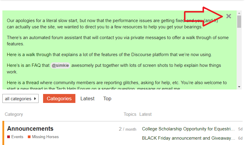
 That would definitely impact the usability of the site if you thought you had to navigate around that big green box every time!