
With your horse’s mane and tail, I would go with black helmet, coat, boots, and pad; and white breeches and gloves (or beige and black depending on the level).
1 Like
This gorgeous chonk of beutificance belongs to FjordBCRF.
1 Like
Yes I know.  I love Fjords and this COTH one is beautiful!
Oh lordt, leave it to the dressage forum to color coordinate with the footing. 
I have a lot to learn!
6 Likes

I want to meet my fellow Arizonan! I still go blues with my chestnut because her white flecks all over make her look faded with other colors vs the blue.
I’m definitely not the successfully matchy type, but I appreciate it so much on others!
I have been looking for a cream pad with gold trim, and cream breeches (and maybe I should add gloves and stock time) for my chestnut with a flaxen mane. Anyone know where I could find them?
3 Likes
2 Likes
Thank you!
Question:
Lots of folks like black on black…i love it actually.
So what do you think of champagne on creme palomino?
Black and white go with anything. And the right cream/ivory/champagne on a palomino would be amazing as a base color for a pad. But you’re likely to have a hard time finding an exact match. You might find a tone (original coat color + gray), a shade (original color + black) or a tint (original color + white) that would look good too. But the wrong base hue and it will look not great.
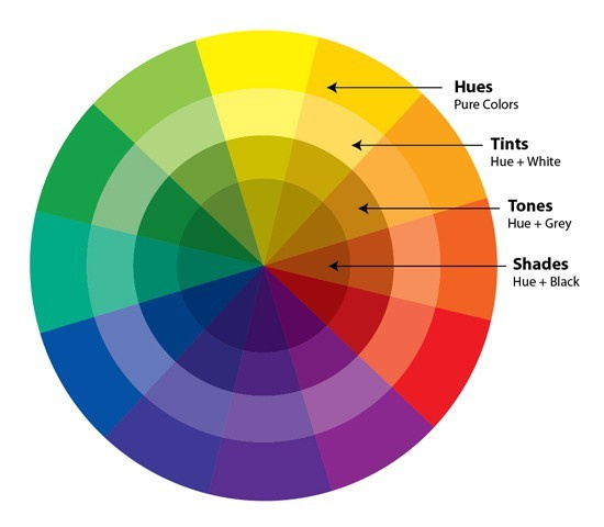
For an already light color, a tone or shade might be easier to find. For a palomino which is essentially cream or yellow remember that those colors are not very commonly made by pad companies. So choosing a complementary color (opposite it on the color wheel) might be easier. In this case, purples and blues.
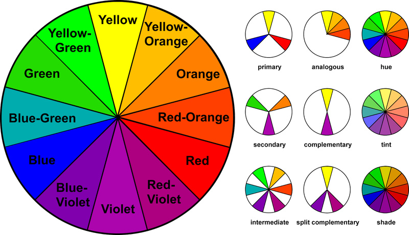
That can be a strong version of the color (purple) or a shade, tint or tone. Then you can also pick another version of that color, a version of the coat color and/or another color entirely as an accent.
Even if your base color of pad isn’t a complementary shade, it can be an analagous shade or really any shade you like, and still work if it looks intentional. Making it look intentional means having multiple parts of your getup in the exact same shade - pad and boot/wraps, maybe ears too. Perhaps stock tie or jacket.
Really at the end of the day, if you like it, wear it!
2 Likes
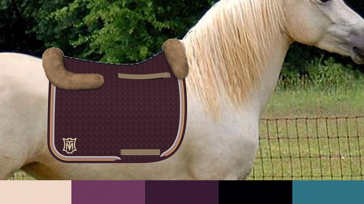
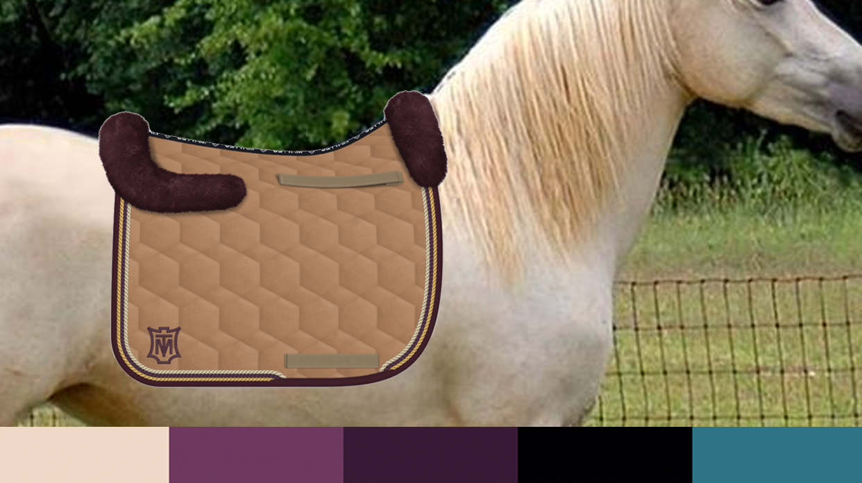
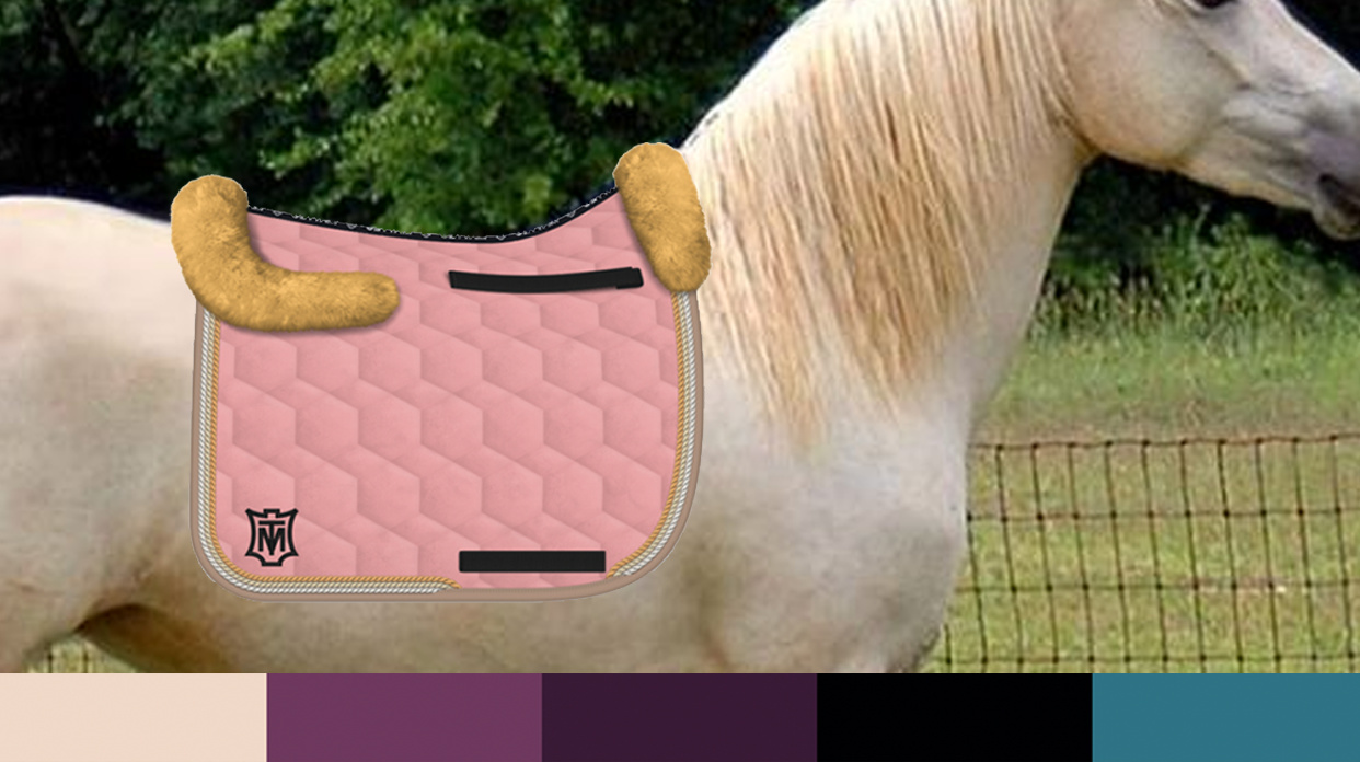
Here’s a pale palomino with a bar of colors at the bottom that are, left to right, the horse’s base color, two shades of purple that work with it, black (because black tack, eyes, boots etc) and a teal shade.
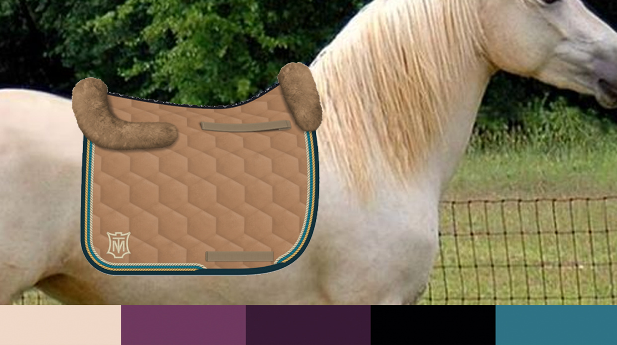
And then a whole load of Mattes pads that use those colors in various ways, just for fun 
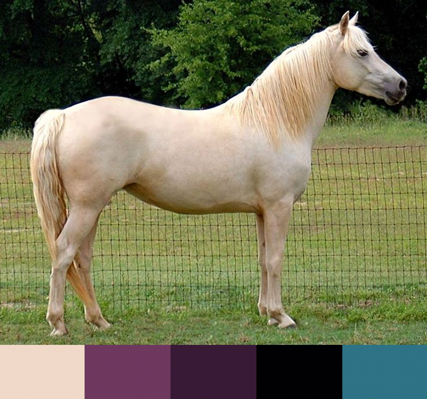

7 Likes
ooOOOO0000oooo ty!

1 Like
How are y’all putting the pics of the jackets and pads over the horse pics??
I like the second one -the eggplant color.
I’m not nearly as sophisticated as Xan, but I just dropped the jpegs in a Google Doc and then use the snipping tool to capture it as a new jpeg.
1 Like
Looks like Photoshop
Yes that’s what I use
1 Like
Agreed, the eggplant looks boss.