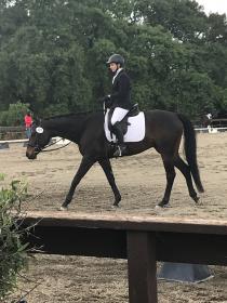
Less Traditional Show Attire (what is "conservative" in color?)

Hi all,

I’m sure this question has been asked before but I tried searching using many different key words/phrases and couldn’t find anything so please forgive me if this is a common question/observation.

I recently fell back into showing after about 5 years away from competitions (getting my bachelors degree and wasn’t able to ride often enough to train for a show and didn’t have the money). A few weeks ago I attended a pretty large show for my state and noticed much more variation in show attire and saddlepad coloring than what I remembered from frequent showing throughout my teens just 5 years ago (think hunter green coats with matching hunter green saddlepads in the showring). I know USDF rules for horse and rider attire say “conservative” but I saw people who really straddled that line…and it was awesome.

So I suppose my question is, how do you usually dress yourself and your horse for a show? Not a schooling show but an actual qualifying show. Where do you think the line of “conservative color” is or should be? Definitely thinking of revamping my old-school black and white look for my next show but curious about what this community thinks. Finally, I’m obsessed with this pad and I think the blue piping is fine but wondering if the blue fleece is crossing the aforementioned line. https://www.hufglocken.com/collectio…e-velvet-blues

Edit to say: I agree with you all and think I’ll forego on this pad for showing due to the color and the logo. They do have a custom pad option so perhaps you’ll see me with a more conservative variation in the future!

Thanks!

I don’t have answers to your questions, but I just wanted to say, I’m now obsessed with that pad, too! (Don’t worry, I won’t buy one of the last ones out from under you!)

1 Like

I would not risk that pad unless I knew for sure, and had it in writing, from USEF that it was OK. Beautiful, but not conservative, in my book.

The Mattes logo is a problem unless you are sponsored by them or pin your number over it.

Gorgeous pad. What color is your horse?

I recently saw someone show at a large rated show in a beautiful blue coat on a dark bay -nearly black horse. It might have been the Horseware Motionlite coat in aviator blue

personally, since I ride a spotted Knabstrupper, I keep things pretty conservative - all black tack, boots and helmet, silver beaded browband with no crystals, white pad and shirt. I do wear a navy coat just because I look like a corpse in black.

I am personally a very traditional black and white girl. I wouldn’t risk anything too far from the norm in the saddle pad department but have seen jackets of all colours in the ring this year: chocolate, navy, pale grey, burgundy, olive, tan, royal blue - colours are definitely getting brighter and more varied.

I wear a grey Kerrits Coat, and love it. It looks great on both of my grey mares. I also have a plain black Kerrits Coat, and just bought a darker dusty blue one. I definitely see colors outside of black and navy at the local rated show that I attend. I think it depends on how bold you want to be, and what looks great with your horses color. Western riders know this, some colors work better than other depending on your horse. On the flip side, I always wear my black helmet, black boots, white gloves, and a neutral saddle pad. I cannot afford to color coordinate my jacket to my helmet and boots. So if it doesn’t go with black and white, I will not buy it.

I am new to dressage and have been told conservative colors would be black, white, navy, and gray. I did buy a burgundy coat I’m obsessed with, though. I wouldn’t consider this pad to be conservative, though it is very pretty, but you could always ask USEF.

the Logo on the saddle pad makes it non-USEF compliant.

It is a little too distracting of the eye. Keep that in mind when thinking about show turn out.

2 Likes

It’s hard to tell. I guess you could buy it to school in and bust it out at shows if you see others with less conservative pads. Sometimes it looks different on the actual horse. My 12yo is into her gear matching and convinced her dad to buy her a LeMieux polo shirt and matching saddle pad for her birthday. She was in love with this weird coral/sherbet orange. I thought it was odd and joked that the pony would buck her off if she made her wear it. The polo is olive trimmed with the same orange as the pad. She used the pad for the first time today and i was surprised. It actually looked really nice!

1 Like

Champagnecolored breeches and pad, brown jacket.
Grey pad or white pad/grey edge, white breeches, grey jacket.
White pad/navy edge, white breeches, navy jacket.

If the horse is colorful itself, I’d be more careful. In my opinion, good riding makes horses beautiful, ‘bling bling’ not always. Brown and light beige though are sometimes ‘softer’ than white and match with a lot of (dark)bay horses (ok, I love brown, cream, copper in all gradings).

If you want/need sheepskin on the horses back directly, you can combine the Eskadron underlay with your favourite saddle pad (does not slip. Spine free version selfmade with a shaving machine)

1 Like

I love that jacket!

1 Like

@MissAriel, i attended a rated show last year where a rider in that exact jacket was told by the TD she had to change to something darker. I think a lot depends on the TD.

I almost bought the most beauuuuutiful sage green Asmar coat at Rolex (I ride a bay), but the shoulders weren’t quite right. I used to ride my grey in a dark grey jacket with a black CO helmet that had a wide light grey suede stripe up the middle. I currently show in a navy jacket, navy helmet, and always with a white pad. I feel like keeping the saddle pad basic (white ecogolds all around!), I can get away with a bit more color on me. Personally, I’ve never been a bling fan, but do like adding some fun-servative colors.

I think if I had a jacket on the edge of being too light, or might be, I would send a picture to USEF and ask for a ruling, then bring a copy of their response allowing it. I wonder if they got enough emails they would do away with the ridiculous color HSV scale rule all together.

I find the pipings on all the seams, bling, patches, overly done contrast lapels, etc to be more distracting than a lighter but solid colored coat with no embellishments.

@EVneo - “fun-servative” is a great new word. I hope if catches on. I think sage green, french blue, eggplant, burgundy, dark green, etc can be great “fun-servative” colors that, when chosen well, add to the beauty of the horse rather than distract from it.

@RTF - yes, the Western riders do a lovely job, generally, of picking colors that coordinate well with their horses, although the WP and horsemanship ones REALLY go overboard with the bling. But even in the ranch riding classes where the outfits are utilitarian they usually choose colors that look great with their horses.

1 Like

I like the traditional black and white look, no bling. In my area I haven’t see very many non-black coats.
[ATTACH=JSON]{“data-align”:“none”,“data-size”:“medium”,“data-attachmentid”:10410502}[/ATTACH]

IMG_3755.jpg

1 Like

Traditional is the way to go. Keep the focus where it should be: on your horse.

2 Likes

I show in this coat on my gelding - it’s a lovely blue with white piping. I have a white pad with blue trims and crystals that match and my helmet is blue with rhinestones. Of course we have a matching blingy browband too. I don’t shy away from the sparkles :lol:

I’m already planning my colors for my filly… She’s a beautiful bay and I’m going with purple. I found a custom coat maker with a beautiful dark purple short coat with lavender trim that I’m already saving for. I also found a super pretty lavender pearl and crystal browband that I’m planning to pick up as well. I don’t know what I’m going to do about my helmet - maybe stick with navy.

An interesting article: https://www.usdf.org/EduDocs/The-Rider/Dressed_to_Thrill.pdf

Here is a tool to help. FIrst, pick a color on the vertical scale. Then, pick an area of the big square and the data table will tell you the HSV of the color you selected. To be legal, the “V” value must be below 32%. V stands for Value and it is a measure of how bright the color is - how light it is. The really large area below the scales will show you the color. https://www.tydac.ch/color/

1 Like

Have you ordered from the link you posted OP? Their prices are great! I want one of their pads, just don’t know anything about the company other than its not in the US I’m assuming.