I use a Chromebook and sometimes when I’m scrolling using the touchscreen I “like” a post on accident. Is there a way to undo that?
I just tried it on your post and you should be able to click it again to unlike it.
Thank you!! For some reason the last few times I tried it it wasn’t working.
And that’ll also remove the notification from the user’s notifications list, unlike the last board, where those were static and couldn’t be “undone”–cool, huh?
(I saw that yesterday when you quoted something of mine somewhere, and then deleted the post!)
Could someone help a girl out and tell me how to get to the bottom of the page? I know it’s probably been covered many times, but I’m struggling here! I can scroll forever and I get to a certain point and it flips back to the top of the thread. The green slide gizmo on the side does not work (for me) Many thanks. Oh, everything is moving FAST today 
Click on that faint green line on the right of posts, where it is fatter and a bit darker and all will self scroll to the last post.
I explained this on another thread, but in case anyone here was wondering or having the same problem, this formatting occurs when you have 4 blank spaces at the start of a line of text.
Like here
I think it might be used to be able to type in lines of code as an example without letting the code actually work. Let me test that.
To make something bold, you can type **this**
Yup, if I type “this” like I did above on a normal line without the 4 blank spaces at the start, I get this instead.
Bluey, the green line won’t work for me for some reason. I did just find that if I hit the time when the last post posted, it will bring me to the end. Thanks for your help, though!
The fat part of the green line works like a slider on the timeline, so you can scroll quickly up and down the thread. Is that working for you – if you click on it, hold it down and move it up and down the green timeline, it should move you around in the thread. You can track where you are by the date/time that shows up by the timeline and also by what post number you’re on, which is shown like a ratio. 209/309 means you’re at the 209th post out of a total of 309.
I also just realized that you can click and drag on that post number ratio thingy, which is next to the fat part of the timeline, and that will also work to drag you around on the timeline – so you don’t have to be that precise with the click!
Try again, drag it down and see what happens.
I didn’t explain it right, sorry.
Do you all think it would be a good change, if they can do it, to just make that whole “box” where the post numbers and date are located next to the slider all one color, so the whole section has a background color that matches the fat part of the timeline slider?

Interesting idea!
Or a box? 

There is a difference in how things used to be grouped. Off Topic, Current Events and The Menagerie used to be subcategorized in “Off Topic”. The various riding disciplines used to be under one header and things like where to find hay, giveaways and technical help were in other headers. Now there are just individual forums.
I totally understand what you are saying @halt but, so far, haven’t found it much harder to stay where I want to be.
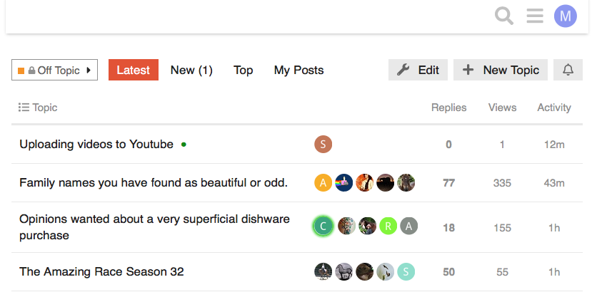
Yes, we got rid of some of the parent categories to actually (theoretically) make navigation a little easier…so all those Forums/Categories where now just one click away. For example, if you wanted to search for Latest posts in just Off Topic, it was easy to isolate that forum from the dropdown list of categories. Like here:
You can then also jump directly to those forums from the hamburger menu list of categories. When they were subcategories, you couldn’t go directly there with one click.
Ok, thanks guys, the green slide sort of works, but I can’t stay on it well and it jumps around ALOT (sounds like a bucking bronco, lol. Is it green for a reason  ?)
?)
Ok, now my head is starting to hurt. Lol.
I think it might be used to be able to type in lines of code as an example without letting the code actually work. Let me test that.
Yep, that’s exactly what the 4 spaces at the start of a line is for 
These are things that bother me just being someone in the IT field. The accessibility of the new forum is very poor. Even the color of the major feature (scroll bar) is not an accessible color and doesn’t meet the universal accessibility ratio for most websites. Making it larger, and a better color contrast will help.
This is a good point and bears repeating.
@JB Think “the design allows the content to be available to all.” There are guidelines (WCAG) that state an acceptable standard for matters like color contrast to serve those with visual impairments, etc.
Is the term Hamburger Menu a real term for those three lines? Or is it something we came up with here on COTH?

