New Forum Fun, Questions and Glitch Reports

Fair enough but there continue to be questions even when pointed to the FAQ with circles and arrows on screenshots. It doesn’t help that everyone is looking at a new page layout and the site was frustratingly slow for several days.

My point was that instead of saying “you can do this, this or this”, it might be easier to offer the most simple option first to those who are still confused by the navigation.

ETA: I just looked at the FAQ again and see what could be a problem. There is no difference between the font in the screenshots and the font explaining them. Some people need pictures and some need words, but that all kind of ran together without a visual distinction between the two, IMO.

2 Likes

There is one font available on this board. IIRC, there was only one font available on the last board, too, so that’s not really a new thing.

I’m sorry that you’re unhappy with every single way people are trying to help.

5 Likes

That’s quite a stretch, but okay.

I did start glancing through the FAQ – much of it isn’t that clear, and I didn’t spot these questions answered. Maybe they are, though …

This thread is too long to see if what I am asking about has been answered … so sorry if this is repetitious. My fingers are crossed that I find out about this info.

– Poster’s names don’t include any of the information that added some life to the discussion - when they registered; total COTH posts; location; etc. It says something about the involvement of the member in COTH, which adds to the sense of the conversation. I’m guessing that will be added?

– No post numbers. How does one refer back to an individual post? How does one link to a post?

– There is the upper right display of total posts in the thread, and apparently the post I am scrolling past at the time … but how do I jump forward to a mid-thread point? It is time-consuming and awkward to drag the scroll bar endlessly, especially for very long threads, seeking jump forward to a third of the way through the thread, or halfway, or to 50 posts before the last post … that sort of navigation.

– Posts don’t have a time stamp. They show the day, but not the time. For me, part of reading through past posts is noting what time of day they were posted - morning, noon, night. It tells me things about the poster and the conversation. And, how fast the replies were coming, or if there was a gap in replies. I am missing out on the sense of the flow of the conversation.

– I did note something to the side saying “6 hours ago”. Sometimes it says “14 m” meaning 14 minutes ago. Not sure it applies to the post I am reading when there are still 160 more posts till the end of the thread.

– I may learn to like the new format. It is a huge change from traditional COTH. It is an awkward surprise (had no idea a change was coming, wasn’t on during the announcement window).

1 Like

And … this is really confusing, I’m lost …

How does one quote another post? I saw the “How do I quote” FAQ – sorry I cannot follow the logic of all the “befores” and shift-returns and whatever, I don’t get what someone is trying to say.

Wait … looks like the quote FAQ has been edited/updated and is more clear with the pictures …

However, when I tried to quote another post using the reply button, the quote did not show up in my post.

Looks like the highlighting to quote might be the way to go instead?

1 Like

This info will be added, the lack is a known issue. Known issues are listed in the first post of this thread, or in the FAQs.

This section of the FAQs might help with both of these:

Hovering over the time stamp should give you post time/date. It’s working intermittently on desktop, but should be ironed out at some point in the near future. If you click on the time stamp on mobile, you get time/date consistently.

Highlighting to quote is very simple & straightforward.

3 Likes

About this specifically:

You can copy the url in the top of the browser window when the post is at the top of the window. The url dynamically updates as you scroll down.

Or

You can click on the “link” icon at the bottom of the post. It’s behind the three dots.

Or

You can click on the timestamp. A little window pops up with some info about the post, and a link to the post.

This has been asked a couple times, so I’ll add some info about this to the FAQ tomorrow :slight_smile:

3 Likes

Thanks for the answers! That helps!

But I have to hover/click on each one to see it? I liked being able to drift down the thread, sort of reading the data for post/poster data with one eye, and the post content with the other eye. As it were. :grin: Anyway, noting the time as well as date while reading adds meaning to a hyper-data-gatherer.
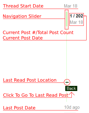
On another note, the green slider navigator is hard to control for jumps forward & back. It’s difficult to return directly to a prior spot, or to return a particular post one has already read. Especially with the lack of post numbers. The browser back button is of course not operational on the green slider. So far thread navigation is not fun, especially on the longer threads (like this one).

I don’t really understand what you mean about lack of post numbers? Every post has a number. It’s listed on the green slider…?

navigate-within-thread-2

See where this image says “current post number”? That’s where you’ll find the post number.

2 Likes

OK I see what you and the FAQ (both might be the same person :wink: ) are saying about the post numbers. Sometimes I’m moving through enough posts that two posts are showing top & bottom of screen, so don’t know which the number refers to, but that can be adjusted for clarity. That’s ok.

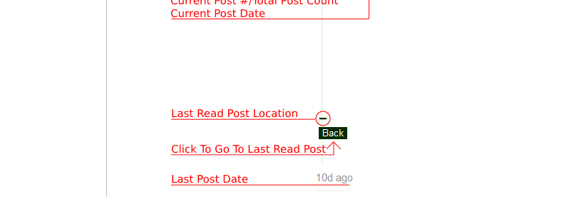
I have not see the ‘back’ marker/button appear on the slider, yet. How would it know which post I’ve read if I’m moving back & forth in a thread (this one looking for answers)? Is that for after jumping ahead or back, to return to the starting point of the jump? I haven’t seen it yet, though. I’m sure I will get used to the slider navigation over time. Right now the slider is like cantering on my green ottb when he’s fresh – the steering is loose, at best, I’m traveling a lot of country that isn’t in the plan, and not much that is. :laughing:

Last one tonight (probably) - I must be missing it in the FAQ, because I am trying to use FAQ - how do I follow/bookmark/watch a thread by title, so the thread will be in my notifications? If I have not posted in it.

And from the FAQ, I’m guessing that “Unread” means notifications from watched threads? Does it track new ‘likes’ on posts as well? Some of this I may figure out with use.

And thanks very much for your help !!! And for writing up the FAQ !!! :slight_smile:

Post number will always reference the post at the top of the screen :slight_smile:

If you want to be notified, set the thread to “watching” in the drop down at the bottom of the thread, or click the little bell icon below the thread slider tool, and set to “watching.”

Bookmarking (via the little bookmark icon at the very bottom or at each post) will save that post/thread to your bookmarks, but I don’t think you get notified. Great way to save stuff you don’t want to forget, though!

The unread tab shows you everything that is marked “tracking” or “watching.” I think :slight_smile:

1 Like

OK so I go to the end of the thread to set the ‘follow’ function (whatever it is called). That’s what I couldn’t find, thanks.

I like the new options for following a thread.

‘Watching’ has ‘notifications’ for every new reply, while ‘Tracking’ has ‘notifications’ only if one of my posts is activated, as it were (reply or like). I guess ‘notification’ means only in the green circle in the upper right (no emails or anything).

So far, though, the notifications in the green circle at the upper right of the screen are presented as just a mess, squshed into the dropdown box, and I have only a few right now. I hope they will go to a full screen again for managing notifications. A few weeks ago I had 63 notifications, but the notifications screen was well organized (for me, anyway) and I could manage them, what and how I wanted to see first, what I would leave for later. And able to dismiss some. However, if they are only displayed in the dropdown, that’s going to be unmanageable.

They’re not.

See the down arrow at the bottom of the list, when you click on your avatar? Click that. It goes to a notification page.

Aha! There they are! Plus easy navigation to Activity and other stuff! :clap:

And under Summary - my old followed threads are there !!! We thought we had lost those. :heart:

Thank you Simkie! Have a glass of wine. And a cookie. :wine_glass: :cookie:

1 Like

Wait, really? Your old subscribed stuff is there?? That’s awesome! Hey @Moderator_1 check this out! Yay!

Thanks for the :wine_glass: and the :cookie:, @OverandOnward! I like both of those things!! :grin:

2 Likes

Under “Summary”.

I’m going to qualify that with a “Yes But”. They are about as organized as the internet, if that gives the picture. :laughing: The first in the list had its last activity in 2017.

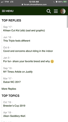
There are two short columns, “Top Replies” and “Top Topics”. I’m honestly not sure what is the logic of what it is showing, but it does have some of my old notification threads. Not sure if it has all of them.

When I clicked “more” at the bottom of the short list, it pops back over to “Activity”. The “Topic” selection shows a thread from October, then one from May, then one from April … no idea where the other threads are that I participated in during that time. The ones that I posted in the most, that are more recent, aren’t in the top section of the list. Haven’t been down further.

So the logic of what is being displayed isn’t completely clear. But it’s something! And we’ll get used to it in time! :smiley:

Looks like they are back :grin:
This is what I see.
If I click on more, under replies, it shows a list of al my replies.
Clicking more, under topics, gives me a list of all my subscribed threads.

I don’t want to seem like a negative nancy but the new platform style seems like a mistake, the old one was better. Any chance of the whole thing being reverted?

Don’t worry about being negative, reading along anyone realizes the change has been less than accepted with open arms by practically everyone, as such changes are said to fare.

Not sure there are any options but to keep working with what we have now, good question in many struggling thru the changes.

Knowing how the old website was failing, barely kept running at the end as it was, not at all “was better”, I doubt it makes sense going back, if that was even possible.

This platform has so much that is better than the old ones, also in other ways is not quite what the others were.

I see the Moderator was able to change that faint scrolling line to darker, so it is easier to find to navigate, THANKS!

We will have to see how this all works over time, once it is fully set to our liking.

Keep giving input on how that is working for everyone.
That is what will help tweak things along for the better.

3 Likes

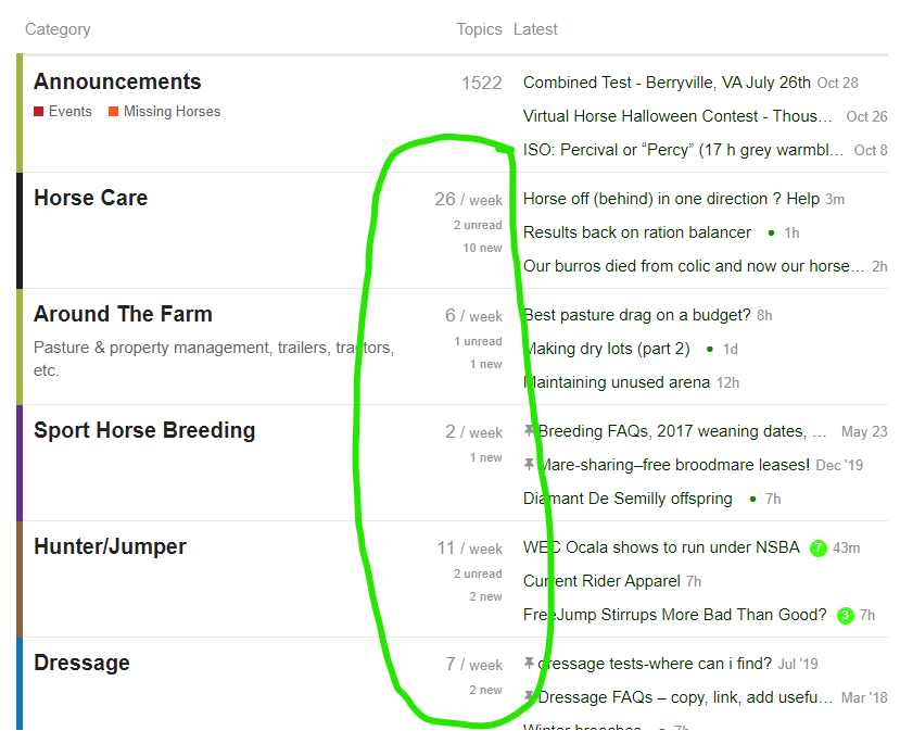
I saw something new (to me) this morning and thought maybe others had not seen it yet so figured it was worth pointing out.

This information is very nice/useful. Quick reference to what activity to check out today.

@Simkie you have brought this back option up before. I have never seen it in all my scrolling. I wonder if it is device/browser specific?

I would say the time stamp works less than intermittently on a PC. Laugh. It rarely works for me.
I do agree with the above that the time stamp does add something to reading the thread.

Still zippy today.

1 Like