Unlimited access >

New Forum Fun, Questions and Glitch Reports

This is probably another ‘you’ve already told me’ questions.

I initially read a New topic but now not as interested. How do I get it to ‘fall off’ my Unread list? (from the Big Mac…) or will it eventually just go away -there are unread threads but I’m no longer interested.

There might be a fancier way to do this, but if you go into the thread, at the top (and bottom) there is a little drop down menu that says ‘Tracking’, which you can change to suit. If you turn off the tracking it doesn’t show up in your unread list. :blush:

3 Likes

Yep, what @Heinz_57 said :grin:

You can also change your “tracking” settings in your profile–IIRC, if you read a thread for 4 minutes, you track it? You can extend that, four minutes isn’t very long!

2 Likes

Missing threads?

I wanted to provide an update post to an older topic in SHB. For the life of me, I can’t find the post! I don’t remember the exact title, it was about yearlings (now 2yos of 2020) born in 2018. It was started by Montanas_Girl. I have posted in it many times.

I can’t find it anywhere in my history. I can’t find it in Montana’s Girl history. I can’t find it endlessly scrolling the SHB page (I don’t remember post date, it was sometime late summer that I remember?). I did a search with terms I remember (including my horse’s name). I can’t find it anywhere. Did it poof? Do I need to learn to search better?

Is this it? [Not-So] Sick Weanling - Update P.5: SHE'S HERE!!

I went to Montanas_Girl’s profile, then under top topics, clicked more and looked for 2018 topics.

There have been some threads that have mysteriously gone missing. There is a discussion about it here:

I think that discussion is about the same thread you are looking for, actually.

I am sorry, the link will take you to the last post.

Ooops… looks like not that thread. Sorry. I can’t find a yearling one either.

Yep, 4 min is the default and I changed mine to never. If I want to track it I’ll do it by setting it myself.

1 Like

I also noticed this morning it is below my Unread ‘since last visit’ line so maybe about to drop off on it’s own but I will do the ‘untrack’ thing :slight_smile:

Oh, and ‘reading’ a new topic I can usually be read and done in less than four minutes if I’m not interested. This was a case where I replied (and typing can often take more than 4 minutes), read a few times and then decided no longer interested.

So, I think I’m off to the topic untrack!

Thank you both!

Yes, I’ve reported her two MIA threads she called out in that post, along with another one that was reported via PM. You’re definitely not doing anything wrong. This information is all backed up though, so I don’t think it should be a problem to resolve once we identify why they apparently weren’t imported initially. Thanks!

1 Like

Do the colors associated with the individual forums…change? I swear tech help used to be green, now it’s black?

Is that a one time deal, or do the colors swap around based on some sort of metric?

Yeah, okay, I’m not losing it! :rofl: Horse care used to be black, now it’s blue, and tech help is black.

:sweat_smile: I did fiddle around with them yesterday to provide better contrast between a couple of adjacent topics, make OT and CE shades of gray so they faded back a bit from horse-related topics in the Latest view, and black just seemed right for Tech Help.

I was considering some sort of “Pick Your Category Color” voting event in each forum at some point, if anyone cares. I’m open to it if anyone wants to organize it…and there aren’t any clear reasons to avoid doing it that I’m not thinking of.

2 Likes

Did the page layout change a bit as well? Or did I do that myself by accident? Lol.

I don’t think we made any changes to that… What looks different to you?

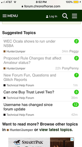
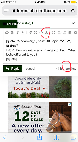
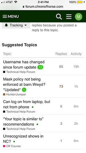
If these pics load in the right order, the first one is from yesterday. The rest are from today. The format is a little different in that today, the info is not laid out exactly the same way, and it has column headers.

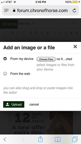
Also, the icon to upload photos is at the top today, but until now it has been near the lower right corner of the reply box for me. And the next screen that pops up after that also has changed a little. It seems to involve an extra step now to actually add the photos.

On the bright side, I haven’t been booted off the site yet today. So that’s an improvement. Yay. Knock wood!

@MHM it looks like you’re using the desktop layout…on a mobile device?

That might be the difference you’re seeing. Mobile vs desktop layout. You can switch back by clicking the three line hamburger menu and then “mobile view” at the bottom.

Yep, just totally reproduced all that by using the desktop view on my phone :slight_smile:

3 Likes

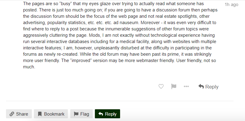
I am sorry to have to say this. The new and “improved” forum is very difficult to use. The pages tend to jump around all on their own. Logging in is problematic (first time in over a week). Your widget still insists I am “new”. I still have so-called “notifications” that appear to be from years ago. The pages are so “busy” that my eyes glaze over trying to actually read what someone has posted. There is just too much going on; if you are going to have a discussion forum then perhaps the discussion forum should be the focus of the web page and not real estate spotlights, other advertising, popularity statistics, etc. etc. etc. ad nauseum. Moreover - it was even very difficult to find where to reply to a post because the innumerable suggestions of other forum topics were aggressively cluttering the page. Mods, I am not exactly without technological experience having run several interactive databases including for a medical facility, along with websites with multiple interactive features; I am, however, unpleasantly disturbed at the difficulty in participating in the forums as newly re-created. While the old forum may have been past its prime, it was strikingly more user friendly. The “improved” version may be more webmaster friendly. User friendly, not so much.

2 Likes

Wellllll, someone has to help pay for the play time we get here :wink:

You mean, the big dark green Reply box with the big arrow at the bottom of the last reply, or the bit Reply with big arrow at the bottom of every comment, and above the suggested topics section?

4 Likes

To be fair, with so many screenshots in the thread it’s difficult to distinguish the real reply button (and other functionality) from the screenshots. There’s no visual separation or border between a screenshot and the forum background. Here’s a pic of what your post looks like. Which reply button is the real one?

Plenty of people are going to be confused and if they click the wrong one, it’s going to open up a picture and that’ll lead to even more confusion. Adding this screenshot is probably going to make things even worse, sorry about that. :slight_smile:

To make matters even worse… if I screen shot some text and paste it like this, which text is mine, and which is yours? It would really help if there was some kind of colored border around pics to make it clear that it is a pic.

Text below this line is just a screen shot and not something I typed:

image