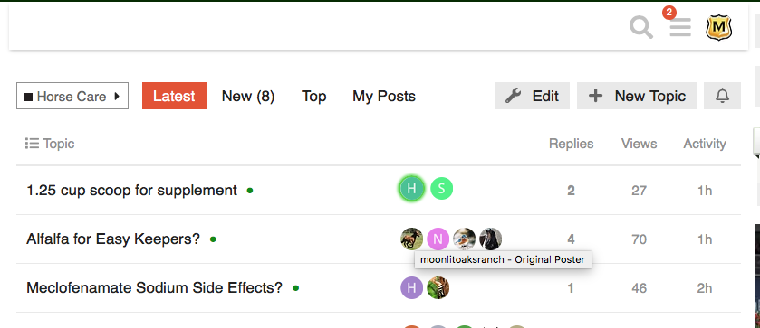
Here’s our current home screen, which you can access from wherever you are on the site by clicking the C icon in the upper left corner.

Should we list our categories/forums exactly as they were on the old site? Announcements, Dressage, etc. Should we have more frequented, non-discipline-specific categories listed first like it is now? Do you have another idea?
What do you want to see?
Also, if you click the menu with three gray horizontal lines next to your avatar, you’ll see a list of categories that automatically customizes itself based on your personal use of the site. So, there, the forums will appear in an order according to where you tend to visit and interact more.
- Exactly how it used to be!
- I like how it is now.
- Something else I’ll elaborate on below.
0 voters

 Maybe you are viewing from the “latest” page instead of categories? If so, you’ll probably like categories a lot better!


