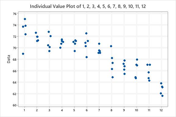
So, having nothing better to do, I downloaded the scores into Minitab. Here are the boxplots of the scores. The Median Score is the line within the box. The interquartile range box represents the middle 50% of the data. The whiskers extend from either side of the box. The whiskers represent the ranges for the bottom 25% and the top 25% of the data values, excluding outliers.
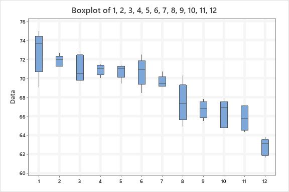
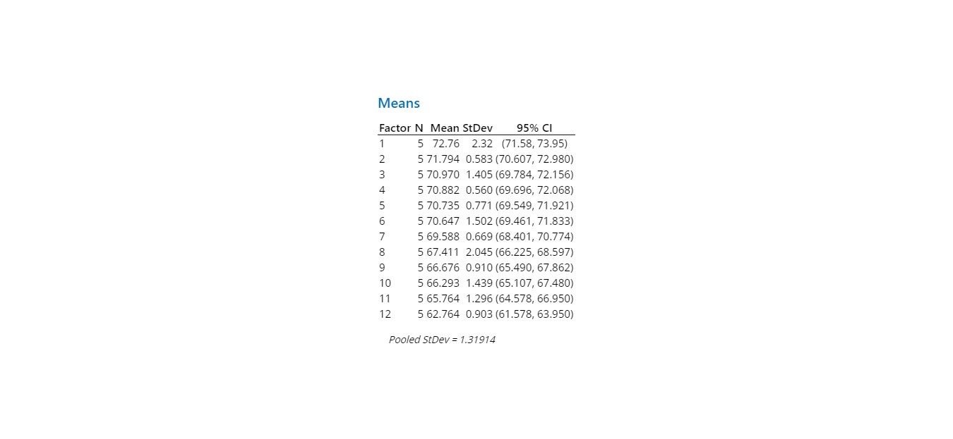
I find it interesting to look at the spread of the scores and the amount of “overlap” of the variation in scores.
Last place scores are obviously different…but look at the scores of the riders placed 3rd thru 6th place. Lots of overlap in that data.
If I were doing this in manufacturing to discriminate quality between production runs, there would be no difference in “samples” 3 thru 6.
I will continue to play with the data.