Hmmmm… mine is still on the right on Chrome.
1 Like
Interesting! I am also on Chrome.
The ads are on the right as they have always been, they just have more space. The forum column has shifted to the left, guessing taking about 2/3rds of the horizontal space. Those changes are not an issue for me, though. The spacing is fine. There might actually be a broader text column.
Agreed. Doesn’t make a statement.
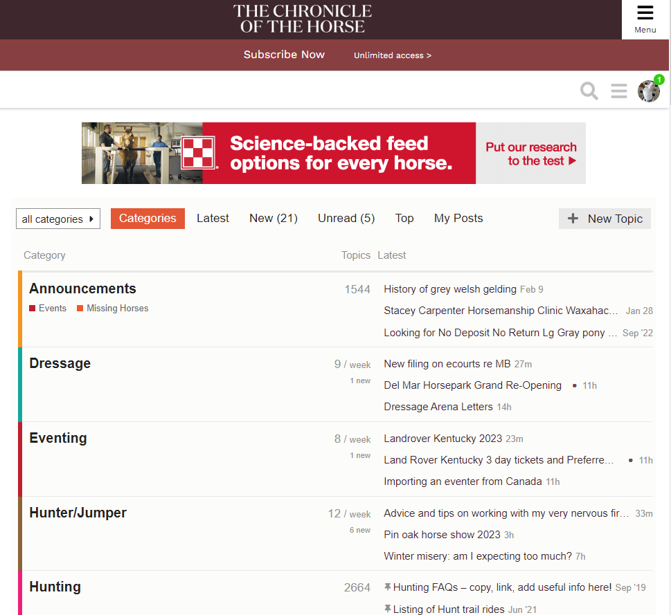
The big “C” that used to be on the left was much more aesthetically pleasing. From a branding perspective, I thought the COTH colors were “tan and green”…
5 Likes
I have a lot of trouble even seeing it on the darker background.
3 Likes
I check COTH on my computer and keep multiple tabs open. You can hardly see the CH now to tell me which tab. Seems the font could be improved.
4 Likes
Likely they will continue to tinker with the aesthetics, now that it is live and they are getting customer feedback.
Same here. The old tab symbol was so easy to see, the current one is practically invisible.
2 Likes
Yes, the tab symbol is ridiculously small. I have opened a new tab and gone to COTH while I had one already opened 3 times today because that tiny plain CH is much harder to see than the old one.
ETA… not as easily recognized as any of my other tabs here:
1 Like
Very much a tongue in cheek vent, but how am I going to know what time it is without the Rolex clock?
7 Likes
On my iPhone, the Current Events will not load— all the others will. Anyone else? I’ve logged out/back in to no avail.
It works for me.
One thing I’ve noticed is that the font stays light on some of the thread titles I’ve read, even when there are new posts. I think that’s happened before, though.
it shows a “lock” next to both Off Topic and Current Events, but I can click on OT and it works fine, but CE just shows a spinning circle. Sigh. Works fine on my MacBook running Chrome. Dislike the maroon color scheme,too.
With the new color it makes links in posts much harder to see. It just looks like black bold text.
1 Like
I wonder if they are tinkering with color on the top banner strip as we post.
It was sort of dark purple, then dark maroon, now … just dark. Not black.
The new CH logo has elements that are so fine, they just vanish and it isn’t readable. Or even noticeable. It’s not obvious what that it is a logo.
I’m guessing that it looked great on another medium, in another setting. On heavy paper in a meeting room. Something like that.
2 Likes
Yep… which is rule 1 of web design. Don’t think something that looks great on one medium is going to look good online. Make sure it works on all browsers and formats before deciding on it.
2 Likes
#2 rule – the color won’t look the same in every browser. On every computer, from aged to just-outta-Best-Buy. 
But these days the color is probably more similar on browsers on upgraded computers than it was several years ago. Back in the day the attempt to perfect the color one saw on the screen was kind of a funny joke.
1 Like
In the early 2000s, I worked for a company that did IT solutions including web management etc. Long story short, a TV station that did a show with a ton of medical content (think large glossary that all those terms in the transcript needed to be linked to) and diagrams and pictures of said medical content. Somehow even though my job was setting up appointments for sales, coordinating and planning seminars etc, I was drafted to actually edit their site (because God forbid they learn to use the content management system we’d sold them.)
The woman in charge of their online presence sent me exactly what she wanted on the site in a Word doc. Because, ya know, Word is a great and powerful web design tool. God forbid my formatting wasn’t EXACTLY like her Word docs. I wanted to strangle her by the end of that project.
1 Like
I just saw the App option show up this morning. I didn’t see it if it was there yesterday.
App seems to be working fine for me - Motorola Droid
1 Like
If anyone is still dealing with an old, out of date forum page persisting when you view the list of topics, clearing cookies for the site does look to resolve that.
Although, sigh, now the “latest” page doesn’t seem to want to load at all, which is maybe why it kept reverting to the old version :-/
The latest page is opening what appears to be normally for me.
I have not seen an out of date list of topics, either.
Windows based desk top computer, using Chrome.