New Forum Fun, Questions and Glitch Reports

Ok, thanks guys, the green slide sort of works, but I can’t stay on it well and it jumps around ALOT (sounds like a bucking bronco, lol. Is it green for a reason :grinning:?)

2 Likes

Ok, now my head is starting to hurt. Lol.

1 Like

Yep, that’s exactly what the 4 spaces at the start of a line is for :slight_smile:

This is a good point and bears repeating.

@JB Think “the design allows the content to be available to all.” There are guidelines (WCAG) that state an acceptable standard for matters like color contrast to serve those with visual impairments, etc.

1 Like

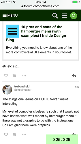
Is the term Hamburger Menu a real term for those three lines? Or is it something we came up with here on COTH?

1 Like

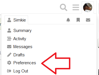
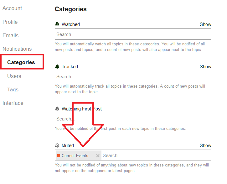
Yep. Mute the forums you don’t want to see.

You definitely don’t need to know this information. :grin: I just explained it in case anyone else was having trouble…or wanted to know how to use it.
Oh sweet!

and yes, if that whole block of things can be more visually apparent, that will help.

It’s a real term!

1 Like

https://uxplanet.org/the-ultimate-guide-to-the-hamburger-menu-and-its-alternatives-e2da8dc7f1db

etc etc etc…

2 Likes

The things one learns on COTH. Never knew! Interesting.

My level of computer clueless is such that I would not have known what was meant by hamburger menu if there was not a graphic to go with the instructions. So I am glad there were graphics.

If the picture shows up, I sometimes have a hamburger in each upper corner of my screen. So… a double hamburger?

1 Like

The left one is for the main Chronicle website. The right one is for the forum :slight_smile:

I think the left one will eventually be replaced with the big “C” logo? Is that still the plan, @Moderator_1?

Can I just say that some of the advice, tutorials and screenshots about all these new functions (green sliders and hamburgers :upside_down_face: ) are less than helpful? It seems that everyone who got a chance to play around with the software in advance is using different language to explain things.
Perhaps just starting with the basics of navigating the forums in ONE way would make it easier to understand and less work for you. It’s going to be different and I think most people can get past that, but there’s a lot of overload right now.

I’ll save my question about how to skip to the last post on a thread without opening it first.

Yes, that is a Big Mac. :cow: :cow:

I did ask them about it, so we’ll see what turns up!

3 Likes

Yeah, that’s what the FAQ really is :slight_smile:

FAQ -- Tips for Using the Site

Great place to start!

2 Likes

This was answered up above, recently.

But it is a good question, that I asked too, on Monday.

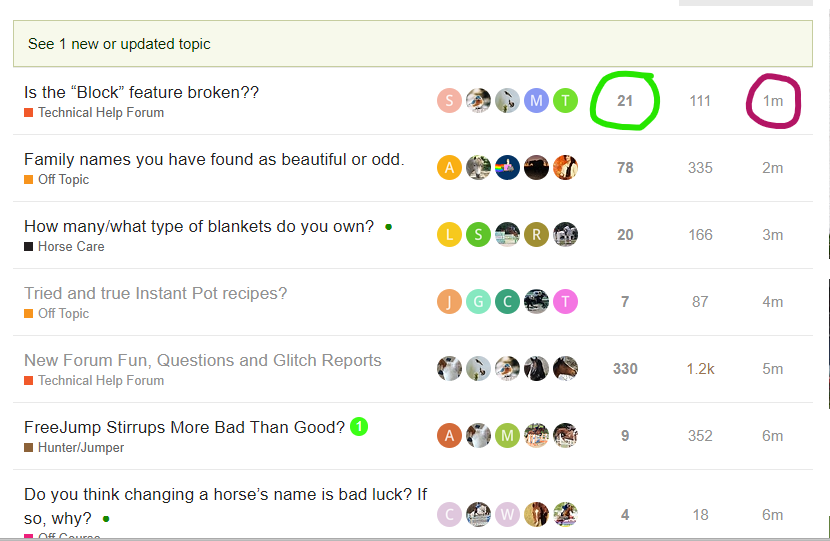
When you are on the below screen you have two choices to go to the end. The number on the right (burgundy circle) is how long ago the last post was. Pick that and it will open the thread on the last post.

The number with the green circle is the post count. Pick that and you will be given the choice of going to the first post or the last post.

This is what it looks like when you pick the post count (green circle). Pick the top one to go to the first post and the bottom one to go to the last post.

3 Likes

Well, maybe that should be the standard reply to questions instead of adding to the confusion. :wink:

Thank you! I thought I saw a post about this somewhere, and tried, but was clicking on the avatar of the last poster (on the right) instead of to the far right on the time of post.

ETA: It works. :lollipop: Learning to click on numbers instead of pictures or words will take some getting used to.

I like how the FAQ sheet gets fleshed out here with all these extra details and different ways of saying things. In fact I’m sure I’d still be lost in a fog without them! :upside_down_face:

Thanks everyone for taking the time!

4 Likes

I feel like at some point earlier in the week, the screen had the big C logo at the top left corner. Or was it on the right? But it evaporated at some point, or turned into the hamburger. The hamburger on the top right corner only appears when I scroll upwards.

So far I have only looked at the new site on my phone, so I don’t know if everything is the same on another device.