New Forum Fun, Questions and Glitch Reports

Apologies if this has been answered, I am still a bit lost in the new format.

Will there be a return to the old format in terms of forum layout? I am still having difficulty adjusting to the current forum layout. It seems crammed together and much less organized. Posts are not chronological - at least not in a way that is immediately obvious to me, and I will scroll a thread and see the same reply 2x - once where it was a direct reply to an earlier post, and also where it is actually timestamped.

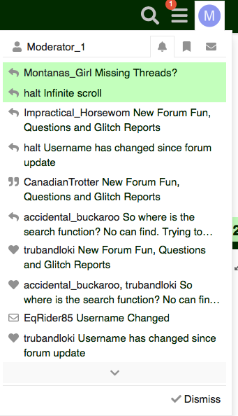
I am getting notifications, but it doesn’t say for what other than “USERNAME > Thread” with no action of what that notification is

Is it possible to have it like it was before, where it would say "Username has replied to your post in ‘Thread name’ "?
I see there are icons (@ for mention, heart for like, etc) but it’d be helpful to have it text too.

Also, I am seeing who likes my posts/getting notifications for posts being liked. Not sure if that is intentional or not, the old forum did not give you notifications and did not tell you who it was that liked your post.

I would still like to see the old tree layout return, when you were browsing a thread (under the thread title) - it would be something like > Home > Hunter Jumper > Thread Title. Now, that layout isn’t there (but you can click the Chronicle Icon to jump home). It seems anti-intrinsic.

Also finding it difficult to return to the top after you scroll a while. Maybe have the scroll how it was before, with pages and an easy link at the top to jump to the top or another page.

Appreciate all you are doing, Moderator 1. I am sure this is a lot of work.

I’ve been through a number of COTH forum reboots, and I do appreciate the hard work the moderators have gone through to ease the transition.

However, I’m afraid I’m going to add my voice to those who just aren’t fond of the new format. I find it much more arduous to get to the end of some long, long threads I’ve been posting in for some time. It’s also more difficult to scroll back to a particular post. I do find the appearance, with the additional white space and bright accent colors, much busier.

I don’t know if feedback is still being solicited (and the speed issue has been resolved for me, the actual forum seems to be operating as it should), but I just find myself spending less time here, and the experience of reading less enjoyable, and information less easy to access.

2 Likes

I think you’ll go to Settings --> General --> About and then look for the numbers listed by “Version.”

1 Like

I can’t say if this is the same on mobile, but if you go all the way to the right hand side where the numbers are (those are the post #s), you can grab the scroll bar and pull up/down quickly, just as you can in a regular browser. You can quickly bounce up or down the page that way.

This was not immediately obvious to me, either.

One other thing - people with longer names are getting their name cut off. Impractical_Horsewoman shows up as “Impractical_Horsewom” in my browser no matter what window size.

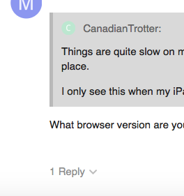
Posts are still listed chronologically, like they were on the old site, the newer posts keep getting added at the end of the thread. There is also an additional way to view posts that are in reply to another post. You’ll see under some posts where it says “x Replies” like you see below. If you click on that, it will expand so you can see the direct replies to that post. If you don’t click it, you shouldn’t see them, and the thread will read in regular chronological order like you’re used to.

If that’s not what you’re seeing, let me know!

Screen Shot 2020-11-12 at 9.13.34 AM

Do your notifications look like this?

If so, the icon tells you the action, the username who did the action is listed next, and then the thread title in which is took place is listed last.

Yes, the default on this software was that all likes were very public and trackable by all users. We didn’t think people would appreciate that. So, now, the user who received the like can see it was from you, but nobody else can see who liked what. They are still anonymous to the public.

The tree is still there, but in a somewhat different format. For this thread, for example, I look at the top of the screen and see the thread title, which is one way to take me to the top of the thread. There’s also the “Technical Help Forum” right below it, which takes me to the list of other threads in this forum. And the Chronicle C takes me to the home page.

You can also click the three gray lines next to your avatar in the upper right and select another category to jump to from there.

When you’re reading a thread, you can click on the thread title to go to the top. On the right side of the page is the green slider on a timeline. Click the top of the timeline to go to the first post, click the bottom to go to the last post. Click anywhere on the timeline to jump to that point in the thread.

When you’re composing a post, you can also click the green box on the upper right corner of the message composition screen, which lists where you are in the thread. That will open up a box where you can click a spot to “jump to” any other post in the thread, while your composition box stays open.

2 Likes

Thanks! I’ll check the character limit and see if that needs to be increased.

Yeah, but I too miss the animated emojis!

Did Mod1’s reply above help? They are still in chrono order, though it does look a little weird when you see a direct reply at the end of the thread, seemingly without context. You can tell it was a direct reply though but at the moment I’m drawing a blank

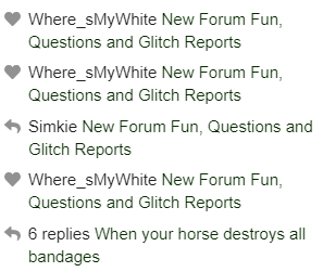
The info is the same as the old forum, just presented differently. For example, here’s what’s at the top of my current notifications:

image

The heart is a Like, and just like the old forum, if you click that link, you get taken to your comment that was Liked

The arrow is a new reply on a thread you’re Watching. So Simkie replied to the New Forum Fun
 thread (this one), and if I click it, I get taken to her comment.

The arrow with the “6 replies” would be the same as the old format saying “Simkie and 5 others replied to your subscribed thread” (or whatever the text was), and clicking it takes you to the first of those 6 replies.

yes, in notifications, you can see who Likes your comments. In the thread itself, everyone, including you, only sees the number of Likes

Click the hamburger at the top, next to your avatar, and you can get to all the Categories (forums)

There aren’t pages. If you grab the slider and slide it fast to the top, you get to Post 1

See my last comment above. Grab the slider and go slow if you’re looking for a particular post #, or fast if you want to get to the top or bottom.

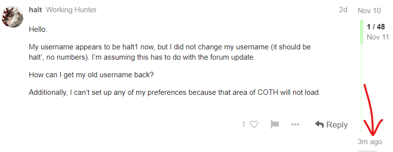
Also, when you’re in a thread, at the bottom right you’ll always see a timestamp of when the last reply was made, and clicking that takes you to that last reply

Hmmmmm, I just muted both successfully. I’m curious if you’ve got a lingering cookie or something that’s hanging up your mute of off topic :thinking:

Yes, my notifications look like your screenshot. I know the icons correspond to what the nature of the reply is, but it should also be in text format - IE “Halt has replied to your thread”. This is not difficult to code.

The tree is not the same. Now it is only the direct subforum you’re in. I can’t jump back to a parent forum anymore when I’m browsing in categories. I can only click home, or the subforum I am in. I did a lot of browsing COTH this way so will miss that feature if it is gone for good.

I know you can click the reply of a reply but really do not understand why this is a feature. It is unnecessary clutter on an already cluttered interface.

@JB the old forum would tell you what the notification was for, via text. The current one does not. It just has an icon with the username and the thread title.

I know so much of this is just getting used to the new forum
 and I am sure the Moderator is exhausted hearing all the complaints (and I do appreciate they are working hard to make sure all users understand this new interface) but this roll out is not an improvement IMHO. I’ve been through several COTH reiterations now and survived, and I will probably survive this one, but I will miss the many posters who just gave up and left because of how poorly this current one is organized.

3 Likes

Can you give an example of what you mean?

From this thread in tech help, clicking the big C takes you home, or clicking tech help at the top takes you back to tech help, or you can click the three line hamburger menu next to your avatar and choose a different forum there, or go to latest, unread, new, etc.

And from the forum level, you can select any other forum from the drop downs at the top left.

Does that help at all?

I guess I don’t understand why it SHOULD be in text format. Arrow symbol, or “has replied to your thread”, both mean the same thing in less space. I have NO idea if that is something that can be changed, either by re-coding, or a plug-in, but for sure it’s not a priority

Did you click the hamburger next to your avatar? That shows you all the forums.

2 Likes

I mean
 do we want to be like Instagram, or like a forum? If we want it to be like Instagram I guess little icons instead of text makes sense. If text is meaningless why not just have the user icon show up instead of the username? At the very least make the username and threads different font weights so it’s clear there’s a distinction between the username and the thread


@Simkie Thanks - I know about the hamburger but still don’t find this forum ergonomic. I understand roll outs can be frustrating and full of unexpected speed bumps, but that isn’t the same as a confusing interface. They don’t even use a good contrast ratio for the scroll, which is why so many people have missed it.

An example was > Home > Off Topic > The Menagerie.

I will keep checking back. As is, I don’t find the forum as well laid out as before. I know that’s not yours, JBs, or the Mod’s fault so please don’t take my comments or complaints personally.

1 Like

Aww, thanks for the kind words.

And thanks to everyone who is trying to help smooth out the bumps in the transition.

1 Like

Avatars can change, usernames don’t

3 Likes

And
 some people do not have an avatar, so all you get is the circle with the letter in it.

3 Likes

Usernames can change as well. Mine was halt1 yesterday :wink: and you can PM mods to adjust names for you.

My point is if you want the forum to be accessible, it’s best to make things clear as possible.

There’s a lot from an accessibility standpoint that is lacking with the current set up.

A lot of names got a 1 added to the end in the transition. Usernames change very, very very little, but people can change their avatar regularly. I know who halt is. I’d have NO idea it was halt by any avatar as I don’t pay much attention to avatars.

1 Like

In the grand scheme of new forum things, I think the fact that there is an arrow versus it saying replied is something that most users will not have an issue with.

I am truly someone who finds change VERY stressful. To the point that I shut down and just can not think. After reading all of the posts in the FAQs thread and getting great responses to questions here I am finding this new format more similar than different than the old format. I do highly recommend reading thru the FAQ thread.

3 Likes

Since I don’t ‘twitter’ I’m not overly fond of this set of emojis. I can find most that are close but all of them, due to the squishy nature, are a bit ‘creepy’. What I did miss this morning was :eek:

Being an Apple biggot (and since it says ‘International’) maybe a more palatable option? It has an emoji close to :eek:

1 Like

I’ve read through the FAQ thread. A FAQ for a clumsy forum interface doesn’t make the interface any less clumsy, though I do appreciate Simkie taking the time to make the FAQ.

These are things that bother me just being someone in the IT field. The accessibility of the new forum is very poor. Even the color of the major feature (scroll bar) is not an accessible color and doesn’t meet the universal accessibility ratio for most websites. Making it larger, and a better color contrast will help.

As would making the notification interface (another major feature with this new forum) better laid out with different font weights to differentiate posters and threads, and what the notification is for. Even FB and Instagram have text notifications laid out this way (User replied to your post) so I don’t see why this is an inappropriate suggestion.

1 Like