I think someone asked this question earlier, but I don’t recall the answer. Is there a visible marker on the threads where we’ve already posted?
Unfortunately I can tell you that the 9.3.5 iOS is going to be end-of-life all over the internet quite soon. Several of the modern coding libraries for web applications - and apps - write code that is completely incompatible with that OS and unless a site is really going out of its way to support those devices, it’s not going to be long before you run into other roadblocks too. My workplace also had to make the hard call to say we can no longer support them. It sucks that working hardware can’t be upgraded but this is our lives now.
I would also add that running very old OS is likely to have some security risks.
The answer was - you can see where you posted by using the tab they have put for your posts.
In other words, no, there is not a visible marker.
I really miss that marker, makes knowing where you posted at a glance, not from memory.
That little marker by the thread title was very helpful, realizing that once is not there any more.
If every time you enter a forum or thread you get that sticky telling you, again, whatever the sticky is saying, remember there is a black x on the right hand side you can click and no more such, you are right in the thread posts, with less to scroll down to find where those start.
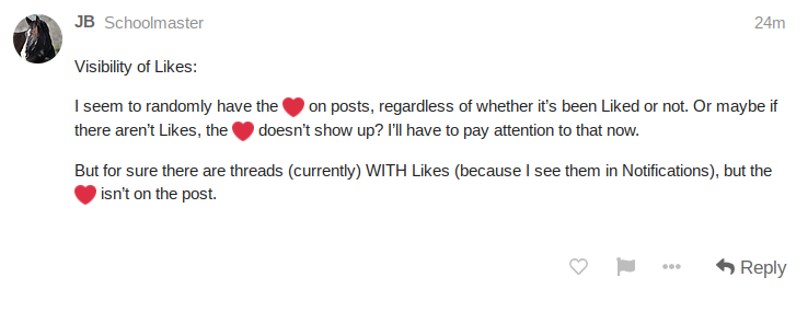
Visibility of Likes:
I seem to randomly have the  on posts, regardless of whether it’s been Liked or not. Or maybe if there aren’t Likes, the
  doesn’t show up? I’ll have to pay attention to that now.
But for sure there are posts (currently) WITH Likes (because I see them in Notifications), but the  isn’t on the post.
You know what I’m going to ask, right?  Screenshot, please?
Threads don’t have likes, posts have likes, so I’m not really tracking your second statement. If you click the “like” notification, it’ll take you to the post that was liked.
@JB Is it your own posts that you’re looking at?
Other people’s posts should look like this to you…
But then your own post will not have the heart unless someone liked it. I assume because you can’t like your own post.
Speaking of screenshots… is there a way to maybe get some kind of border or background color on pasted photos and screenshots? When pasting a screenshot of text, it’s hard to tell what a poster typed vs what’s a pic when you’re just scrolling through. For example, the following screenshot of @Simkie’s post looks like it’s part of my post rather than a screenie.

Haha! I edited my post - did NOT mean threads, meant posts
I knew I should have grabbed screen shots  I will keep an eye on it all and grab them next time. I wasn’t imagining I swear
Ok, but this is cool. I had another browser window open so I could easily check on all this. I was in another thread, and because it’s that nifty, this reply box was open there too. I forgot where I was, was typing more there and hit Reply. It knew I was in 2 different threads and asked me what I wanted to do. I don’t know why it didn’t know the thread name of this one though, it just knew the name on the one I was currently on:

FWIW, it isn’t that the vendors want to sell new hardware (yes, I’m sure they do) but as has been mentioned… hardware improved over time. Software improves to take advantage of the new hardware. At some point, it is not cost effective for the vendor to continue to support older hardware in newer releases of software. Or (since I’ve worked for both hardware and software vendors), as new features and functionality are added to software, it becomes, again, not cost effective to maintain (fix bugs, support new hardware) older versions.
Yes, it sucks but it is what it is.
My personal objective (on the Apple platform) is to keep my iOS and MacOS updated and pray the day that Apple tells me my iMac can’t be updated never arrives.
I back up regularly. I keep my software up to date. I dread the day my hardware is too old to be upgraded again. 

I hear you, my laptop is an older MacBookPro and the latest download failed.
If I want it, which I need for the newer stuff and security, I will have to work on cleaning out old programs so it will have room and tweak this and that to get the new stuff installed.
The alternative would be, buy a new one, that program comes already installed in it, a consideration, given the age of mine, but the price, ugh!
Still thinking about it and, as long as there are no problems, just waiting a bit longer.
One important problem with today’s “new” stuff, how long before that will be old also?
Everything is changing so fast in technology, that is what we are experiencing here too.
Guess all that thinking by necessity keeps our brain cells fit. 
Oh, yeah… neither hardware nor software lives forever. Either the hardware will fail or be so out-of-date there is no current software that will run on it or vice versa… the hardware is fancy but the software can’t run on it.
With my current financial state… I will live with what I have until Apple says no upgrades and then figure out what I want to do and accept the consequences of my choices 
Y’all, I so appreciate your efforts to improve the site. And I recognize that I’m a fogey and it will take me time to get used to the new place.
But.
There is so much visually going on that it’s distracting to the point of me choosing not to visit Coth. I’ve been a daily visitor, often dropping in many times in a day, for years. Now, there is too much visual information happening - so much so that I feel like I can’t focus. Ads to the left and ads to the right, then all the colors, and the addition of the avatar circles on the roster of pages - it’s like falling confetti for me.
I will keep trying. Coth has been a significant pastime for me. If there’s some way to take out some of the extraneous graphics (like the row of avatar circles), that would be a help, I think. It would make things seem less confusing.
Although yes the vendors do enjoy selling new stuff, there’s also a very real and huge maintenance headache constantly fighting off hackers and the like for anyone selling hardware or software. OT but a podcast I recommend on this topic is Darknet Diaries - an approachable and entertaining set of storytelling around people who spend their lives figuring out ways to break and break into computer systems. It may be helpful to understand why these upgrades are personally and socially beneficial and something we have to adjust to expect. That’s the reason we couldn’t stay with the old software.
So I love you all and this is small beer in the grand scheme of things but I’ve lost count of the number of different shades of green from the forum configurations and the larger COTH site and the COTH house ads and it’s maybe something you could put on your to-do list. As it happens not all shades of green are harmonious with each other, and if I didn’t know that before, I surely know it now.  Have someone build you a WCAG-friendly palette of a few colors when things settle out and I think we’ll all be subtly happier.
  (Not even I can comfortably read white text on a neon green circle!)
(I meant there to be a screen shot here but it’s not showing up, confused…)
Looking forward to seeing this effort mature and get more comfortable with time.
I thought I was the only one who could not read the white number in the neon green circle.
Where are you guys seeing white on neon green? Maybe I’m not seeing it at all. Lol.
I think that depending on knowing who is first poster and last poster on avatar circles, something not that many posters have and are harder to remember than names, is not really better for that purpose than posters names?
Couple places 
It’s the “you have a new notification” alert:

And also the “this post that you’re tracking has a new reply” indicator:


