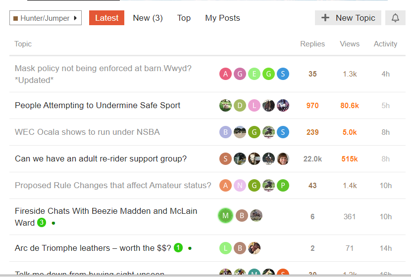
I really like leesa1’s Version Without Avatars. Hope someone comes up with a way to do that on Chrome. Thanks leesa1 ! 
Wait - previews? - I haven’t seen “sticky previews” mentioned in any of these tech help threads. (I did see that the hover-previews are on the “to-do” list.) How are the sticky previews turned on?
I haven’t seen any in this forum but I saw some over in the Off Course forum.
I’m just a user, I have no affiliation or involvement with the site so please take anything I say with a grain of salt. 
I think you two are taking about different things 
@avjudge hover to preview is still TBD
@leesa1 is talking about the first line or three that show (without hover) on the pinned threads?
I actually mentioned both (hover & sticky previews) in my post! I stated (knew) that hover is a to-do, but completely missed that everything I can see in @leesa1’s screenshot is a sticky. Oops.
I just got kicked out — again!
Then it didn’t want to accept my password for several tries.
Then it offered a menu with my password and let me back in???
Annoying.
Thank you SO much, @leesa1. Your simplified-looking version is marvelously better. You’ve earned a Golden Snaffle award.
I’ll look for the @Moderator_1’s info regarding how to do it on Simkie’s FAQ.
Brilliant!
I kept getting kicked out anytime I would click on anything (to reply, to go to a new thread, etc).
I logged out of everything (main page & the forum). Then logged back in.
Haven’t gotten kicked out once since doing that. 
It might work do you as well 
Tried that, didn’t work, just got kicked out again a minute ago.
Happened after clicking on a link to a feeder on a post.
That may have something to do with it?
Interesting little trick that, not sure now it is because they are working on the web site.
Leesa has provided the step by step on how to implement that. Feel free to add the custom CSS to Firefox!
What kind of interest would there be for implementing something like this simplified view for everyone? Would anyone miss having the “frequent” middle posters listed. I was thinking myself that the OP and most recent posters were probably the info most people would be interested in.
I’m not sure they could implement it as an option or if it would be an all or nothing sort of change, but I can certainly ask!
I quite like the additional info on the middle avatar circles and find it adds value. If a “lite” view is implemented, could it be offered as a theme choice from the user settings?
I am fine with the avatars that show now.
I will also be fine if it gets edited and they do not show.
I can see a positive to both options.
Second that ^
An option would be ideal
I too love the avatar circles
I’m also ok if it’s all or nothing and the simplified version wins
One thing I miss is the date started showing up anywhere when looking at a list of threads.
Is this a new thread about an old topic, is this that same old thread about that topic, is this a thread started years ago that someone bumped by accident? None of that is obvious looking at the thread list.
Disclaimer - I will learn to live with out a started it if necessary, just mentioning it because I keep looking for it and then have to remind myself it is not here.
That keeps coming up, the circle avatars don’t help much, since many are just letters, not really indicating who that may be anyway.
The old web site had who started a thread and when right with the title, which really helped figure if it was one to check out or just scroll by.
I think the Moderator said they were looking into that for now or later tweaking, if necessary?
Hovering tells you:
the left-most avatar is who started the thread
the right-most avatar is the last poster
If there are more than 2, the middle ones are the 1-3 most frequent posters
That said, actual names don’t require action to see that, but they would take up more space , unless it’s determined ALL we see is the OP
True that, but I thought we were considering reading as presented, a quick overall glance, not adding other from us, like hovering or clicking to get more information.
I’m good either way having the screen space for as large a window as I’d like.
What I often care about is the OP of a new topic… maybe sometimes the last poster in an on-going thread. But, the way my brain works (be kind now 
 ), I often don’t even notice the avatars or ads on either side. This is coming from someone who can sit on the couch with the TV while reading a book and completely miss what’s going on in the TV show…


