
I thought everyone did this!
3 Likes
After we get log-in issues completely resolved, I will ask about offering a simplified view as an alternate theme choice.
We had an alarming issue with a few users reporting being logged in as the wrong user. That’s clearly been a priority to resolve! I have an update I wanted to share for those who are interested in following along. Nobody “needs” to understand this, but I want to keep everyone informed as much as possible when we experience a problem like that:
Discourse uses a process handling service called “Passenger”. It creates a process for every user request. These processes queue and handle every user activity on the site.
The issue was that Passenger service mixed up processes at times and as a result sessions were mixed up. We’ve updated its configurations to prevent this.
We’ve researched on this and found that this is somewhat a known issue in Dev community for Rails (The platform Discourse is built on). Devs proposed different solutions for this and we’ve used one of those solutions.
So, hopefully, the solution implemented has resolved that problem, but needless to say, let us know if there are any further issues! This log-in problem was a separate one from the new versions of existing accounts being created when there was a conflict with emails in our different databases. I think they’re still working on that issue, but the other one took precedence.
Please know that we take these concerns seriously. Please be sure to continue to tag me if you see someone mentioning issues elsewhere on the site that haven’t been addressed.
We very much appreciate everyone’s help in getting this new platform up and running and catered to your needs and preferences as much as is feasible.
8 Likes
Not sure if anyone has already posted about this…
When I return to the browser tab after being away for a short time there’s the message box at the top that asks me if I want to see the X new or updated topics. When you click on it the list reloads and briefly highlights the new/updated topics in green. Unfortunately that green highlight fades after just a second or two which makes it very hard to scroll to the first updated topic before it blends in with all the others. I wish the highlighting remained in place longer.
Note, this is different from the “last visit” line that appears when you haven’t been on the page in a while.
Not saying that this is the same function, because it does require an additional click or “hover,” but the OP shows when you hover over the first avatar on the list. If you click on the number of replies on the thread, it’ll show the date it was started and the date or time of the most recent post (and both of those are clickable to take you to the first or last post).
Again, not the same…you can’t take it all in with one glance, but it’s accessible.
2 Likes
Good reminders.
Thank you.
I’m still getting booted off the site every time I turn around. That’s starting to get a little old.
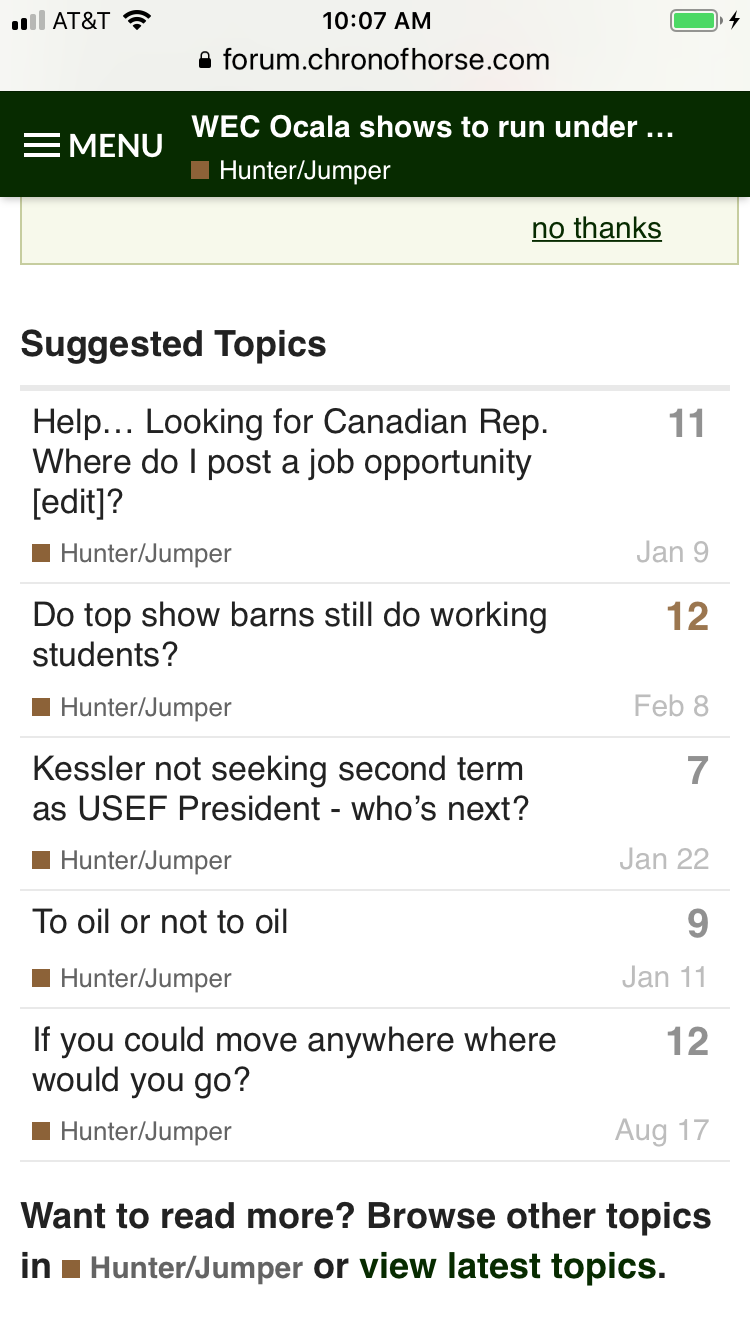
And this seemed odd. The suggested topics at the bottom of this post in H/J just now were several months old. And they didn’t seem to really be very related to the topic.
I forget if you said earlier… platform and browser?
Seems like a few folks have had this issue. Wondering if it is either/both/neither platform (ie, phone (which one), tablet(which one), laptop, desktop) and browser related.
I’m using Safari on my iPhone.
1 Like
I think others have already mentioned it, but I am still waiting a long time for the pages to finish loading. And they jump around a lot in the process, so I will often click on something and end up on a different thread than I intended, or even on an entirely different page if I accidentally click on an external link, like an ad.
Moderator_1Administrator
What kind of interest would there be for implementing something like this simplified view for everyone? Would anyone miss having the “frequent” middle posters listed. I was thinking myself that the OP and most recent posters were probably the info most people would be interested in.
I don’t find the avatar circles useful at all so I definitely prefer the simplified version. The idea of frequent middle posters is lovely, but avatars do not communicate that for me.
This layout you showed is much more comfortable and accessible to me and I think would be so for most people.
Hover isn’t accessible on touch devices. It’s okay to use it for supplemental information but you have to be careful using it for anything essential/important. On our team we’ve had to move away from using hover, only adding it back in when it’s really okay with us that only desktop users can benefit. I don’t know what COTH’s numbers look like, but for the application I support, touch devices are about 60% of the traffic.
2 Likes
How do we delete posts? I don’t see a trash can icon anywhere when I edit a post.
Phones, especially Safari, are pretty aggressive about cookie scrubbing for privacy, and there are also device level settings that make it more aggressive. @MHM you might look into your settings to see if you are able to allow chronofhorse to save cookies longer.
Hmm. Would it have changed overnight, though? I wasn’t getting booted off for the first week or so on the new board, and now suddenly I’m getting kicked off all the time.
Here you go:
If your iOS updated overnight, it may have reset that value.
I don’t think it updated. Or if it did, I didn’t get the usual alert about it. 
Thanks. I was thinking it was still done via the edit button.
@Moderator_1 I have not been logged out of the forums by the website . I’m using a laptop though, not a phone.
If you’re trying to log out via the Forums, and you’re getting signed back in automatically, you’re probably still logged in on the main site. Does logging out there resolve the issue?