Unlimited access >

New Forum Fun, Questions and Glitch Reports

What was the problem when the transfer from the old to this new format everyone was given a trust level of Zero, even though a poster had been here for decades…and the new system Knows those posters (there are reminders about “Welcome Back XYZ who has not posted for five years”)

But one had to Earn a Trust Level on this new format just to ignore a poster…even though the system already knows you have been posting for tens of thousands of posts… none being spam.

Well, right you are but then, nothing is “perfct”, is it.

I think they are still working on all that?
Probably will soon, since they got the poster’s ID mixups at login back on track, if I got that right.

2 Likes

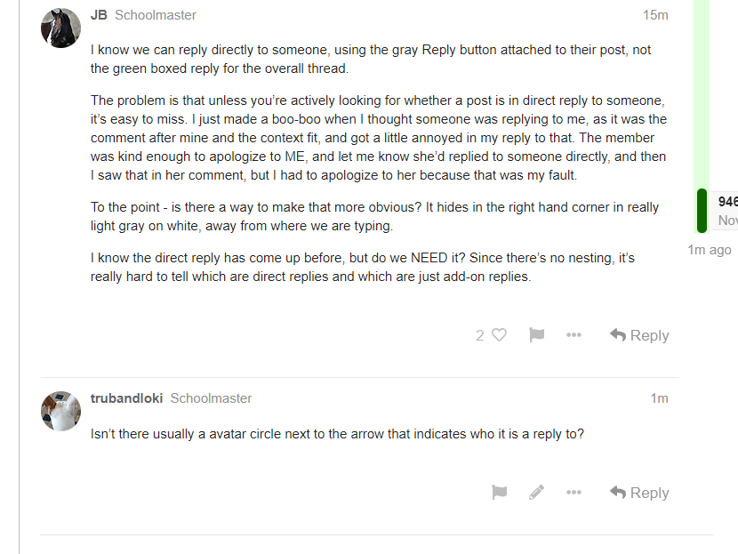
I know we can reply directly to someone, using the gray Reply button attached to their post, not the green boxed reply for the overall thread.

The problem is that unless you’re actively looking for whether a post is in direct reply to someone, it’s easy to miss. I just made a boo-boo when I thought someone was replying to me, as it was the comment after mine and the context fit, and got a little annoyed in my reply to that. The member was kind enough to apologize to ME, and let me know she’d replied to someone directly, and then I saw that in her comment, but I had to apologize to her because that was my fault.

To the point - is there a way to make that more obvious? It hides in the right hand corner in really light gray on white, away from where we are typing.

I know the direct reply has come up before, but do we NEED it? Since there’s no nesting, it’s really hard to tell which are direct replies and which are just add-on replies.

2 Likes

Isn’t there usually a avatar circle next to the arrow that indicates who it is a reply to?

1 Like

Well, that is weird. I used the reply to this post option in the lower right of your post, @JB and my post does not indicate (to me) that I replied to your post. Did they get rid of that feature?

Edit to add:
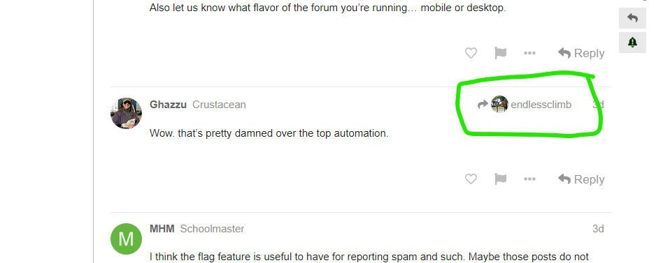
I was expecting something like this (scrolled up to find this).

Edit to add 2:
I like that notification. It has helped me more than once know what is going on when someone posts an answer that it is not obvious who or what they are replying to.

Yep

That’s the exact feature, but no, I don’t see anything indicating you replied directly to me

Yep, that’s how it shows up - right curved arrow, avatar, username. And I see it when I’m looking for it, but it’s not “in your face”, which, now that I think about it, has cause many people to miss that it’s a direct reply

I’d probably make note of it if the comment seemed way out in left field. In this case though it appeared as if it was a reply to me, just made as a regular comment

Maybe if that notification can be moved to the left, as in (for your scenario), directly next to “Ghazzu Crustacean” it would be obvious every time

@endlessclimb how dare you offer honest advice! LOL… that’s a bad reason for a flag. wow. That definitely needs fixed.

Something I’d talked to the developers about was the possibility of automatically including full test quotes to replies. So, right now, you click reply to a specific post and it will indicate who you’re replying to in the upper right corner, and you can get that message if you click on it.

You can also get the full text of the quote added to your reply if you click on the speech bubble in the reply box.

I said that the community may prefer to have the quote always included, but that we could wait to see what you all thought once you had a chance to play around with it. I’m happy to propose that change if it seems like it’s fairly universally desired.

I guess in some communities, they try to streamline the amount of quoted material, but I’m not so sure that is what this community prefers.

It’s not a default option to enable or disable, but believe it’s something we should be able to do.

Just wondering if sig lines are now a thing of the past.

Given how little I suspect the Reply To is used, that might be the best option.

1 Like

They aren’t a default option, but I know I saw there have been plug-ins written to implement them on this software. So, if we get lots of feedback that they’re missed, we can look into it. There are some options already available when you click on someone’s avatar, a “card” shows up in which the person can link to their website, etc., so that can be something to play around with in your Preferences.

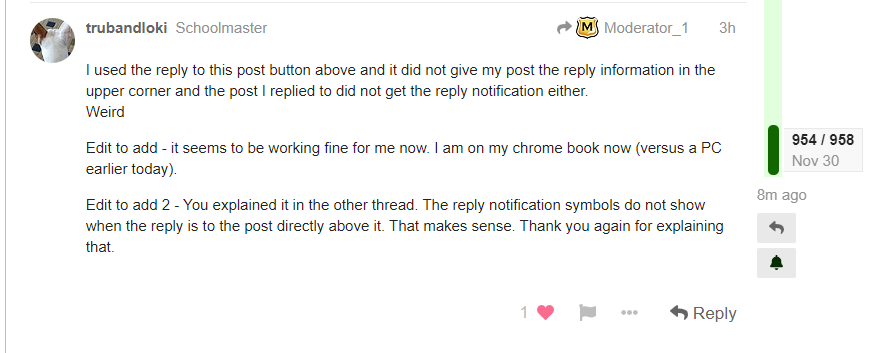
I used the reply to this post button above and it did not give my post the reply information in the upper corner and the post I replied to did not get the reply notification either.
Weird

Edit to add - it seems to be working fine for me now. I am on my chrome book now (versus a PC earlier today).

Edit to add 2 - You explained it in the other thread. The reply notification symbols do not show when the reply is to the post directly above it. That makes sense. Thank you again for explaining that.

1 Like

I think I’d prefer not to have every post that’s replied to quoted by default, just makes all the posts lengthier, and the quote function is so much better here than the old format that it’s more likely people will quote something if they feel it’s needed.

6 Likes

If including the full text is used only when replying to a specific post (ie, bottom right of the post ‘box’) then I’d be ok since I don’t use that Reply often.

I’m in the second group of wanting to streamline what’s quoted…

I really like having the option of what test gets quoted, if any, when direct replying to a poster.
I also use the direct reply feature quite a bit.
IMO, on the mobile version, it is noticeable to see when someone has direct replied to another poster.
Maybe it’s different when on a computer🤷🏻‍♀️

Did the reply “nesting” feature get disabled?
In the beginning I had seen posts that had the notice underneath, which you could click & see all replies pertaining to that particular post.
I’m not seeing it anymore.
Unless it due to having read all the previous replies in those threads already???

Here’s what it looks like on a laptop

It’s not invisible, it just isn’t something my eye is drawn towards. My eye first sees the poster’s name, and then starts reading the comment, and by the time I’m reading to the right of the screen, my eye isn’t moving up again to see that reply notation. That’s why I think if it were moved to be directly beside the commenter’s name, it would be much more visible

If you click the arrow/username who was replied to (so Moderator_1 in my screen shot), the replied to comment will show nested relative to the rest of the thread. But that’s not the default.

1 Like

That’s still here. Check out post numbers 950 and 951 in this thread. :slightly_smiling_face:

1 Like

Still there, but you have to click the v to expand it, it’s not auto-expanded.

I just want to note persisting (up to the present) issues/concerns/questions I have, just to pass on the information, and maybe someone can tip me off in places where I’m going wrong::

– still times when the forum loads really slowly. Not always, but it was doing it on me last night. Any change in settings I might try?

– how can I scroll back up to the top of a thread so I can see the menu on the left side? What happens is, I zip the scroll block all the way up – it appears to go to the top, then after a moment it blips back down. Repeat, repeat, repeat til I can finally actually get to the top and have it stay there. Is there an equivalent to the “page up” feature that might help here? Or should I adjust how long/how many posts load at a time or something along those lines, if that is even possible?

– I do see some discussion of the nesting features that I need to dig into, but what I have on my screen is – I see the nested replies, then as I read down, I see all of them again as un-nested replies. It’s another source of a lot of visual clutter, and interrupts the flow of reading as you start to read a message, then realize you’ve already seen it, you have to reset mentally where the flow of the discussion actually is at that point, etc.

– Just a comment that I have been through several versions of the COTH forums. None of the past revamps/new platforms have ever resulted in my needing to consult technical help or to mistakenly think that forums and features are gone, but really weren’t – things like that. I didn’t have to check into problems with scrolling or anything basic or advanced – always pretty intuitive and easy to figure out just by using the forum.

In short, my point is that those of us with issues/dislikes about the new format aren’t just nostalgic luddites. Though to be fair, I think the moderators and other forum staff are more understanding of this – it is other users who are disdainful and sometimes even downright insulting.

But this new format is not intuitive in many ways, and there was a lack of notification of users of possible issues. I am a longtime member of a figure skating forum which also just moved to a new platform. We had almost daily mass/all user pms when the change was made, telling us how to use common features if they were different from before, or to warn of large scale problems, if they cropped up.

With this forum, I would think there would have been a way to direct message users with, for example, the large [username]+1 issue. I was affected, never even noticed it for weeks – I logged in the same as always (same password, it never stopped me from getting in as usual), I started learning my way around the new forum, made no complaints – didn’t like it, but understood a change had to be made. But I went for weeks just assuming some features and subforums had been lost – but it was actually just that my account was affected. Couldn’t affected users have gotten some kind of pm notice about that, using a search for accounts with the +1 to identify those affected? Sure, a few folks might really have a legitimate “1” on the end of their username, but that wouldn’t be too many false positives, and a disclaimer in the message would have addressed that possibility. Yes, there were discussion threads on issues – but if you don’t even know you have a problem, why would you go reading a glitch thread?

Again, I think the COTH forum staff have been understanding the users are stakeholders, and have potentially legitimate concerns, and I do appreciate and thank you all for that.

If it’s at night it might be due to Devs working on updates. I’d start tracking times to list so maybe Mod1 can see how that lines up

Are you scrolling with the browser scroll, or the forum scroll? If you grab the forum dark green scroll bar and zip it to the top, it should take you to Post 1. Or, click that box where it currently says 962/962 and you’ll get an option to jump to any post # you want.

Yep, replies appear “out top” in sequential timestamp order

There’s a whole FAQ section that’s been referenced many times, with almost anything you could want to know how to do

1 Like